
![]()
From Satellites to Solutions: Drought Monitoring with Google Earth Engine
Registration: https://www.nesdis.noaa.gov/events/satellites-solutions-drought-monitoring-google-earth-engine
Notebook: https://geemap.org/workshops/SatMOC_2024
Earth Engine: https://earthengine.google.com
Geemap: https://geemap.org
Introduction
This notebook is designed for the summer short course offered by the American Meteorological Society (AMS) Committee on Satellite Meteorology, Oceanography, and Climatology (SatMOC).
Description
Droughts pose a critical threat to water resources, agriculture, and ecosystems worldwide. This hands-on short course will teach you how to harness the power of Google Earth Engine (GEE) to monitor and analyze drought patterns. GEE's vast repository of satellite data and powerful cloud computing capabilities will streamline your drought research and decision-making.
In this short course, you will:
Explore the fundamentals of remote sensing for drought monitoring.
Learn to calculate and interpret key drought indices such as the Palmer Drought Severity Index (PDSI) and Standardized Precipitation Index (SPI).
Master GEE coding techniques to process large geospatial datasets.
Create dynamic visualizations that track the evolution of drought conditions over time.
Develop tools to support local and regional drought management strategies.
Prerequisites
To use geemap and the Earth Engine Python API, you must register for an Earth Engine account and follow the instructions here to create a Cloud Project. Earth Engine is free for noncommercial and research use. To test whether you can use authenticate the Earth Engine Python API, please run this notebook on Google Colab.
It is recommended that attendees have a basic understanding of Python and Jupyter Notebook.
Familiarity with the Earth Engine JavaScript API is not required but will be helpful.
Attendees can use Google Colab to follow this short course without installing anything on their computer.
By the end of this short course, you will have the skills and resources to confidently integrate Google Earth Engine into your drought monitoring and decision-making workflows.
Agenda
This short course consists of six 30-minute sessions. During each hands-on session, the attendees will walk through Jupyter notebook examples on Google Colab. At the end of each session, they will complete a hands-on exercise to apply the knowledge they have learned in each session.
Course introduction and software setup (30 mins)
Introduction and location of short course materials
Introduction to Earth Engine and geemap
Google Colab and Earth Engine Python API authentication
Using Earth Engine data (30 mins)
Earth Engine data types
Earth Engine Data Catalog
Exercise: creating cloud-free imagery
Visualizing Earth Engine data (30 mins)
Geemap Inspector tool, plotting tool, interactive GUI for data visualization
Legends, color bars, and labels
Split-panel map and linked maps
Timeseries inspector and time slider
Exercise: visualizing timeseries precipitation and vegetation data
Creating timelapse animations (30 mins)
MODIS vegetation indices
MODIS temperature data
GOES satellite data
Exercise: creating timelapse animations
Drought monitoring (30 mins)
Exploring drought datasets
Creating drought timeseries animations
Computing zonal statistics
Creating interactive charts
Exercise: visualizing drought data for a selected region
Analyzing and visualizing precipitation data (30 mins)
Exploring precipitation datasets
Creating precipitation timeseries
Calculating Standardized Precipitation Index (SPI)
Exercise: calculating SPI for a selected region
Introduction to Earth Engine and geemap
Earth Engine is free for noncommercial and research use. For more than a decade, Earth Engine has enabled planetary-scale Earth data science and analysis by nonprofit organizations, research scientists, and other impact users.
With the launch of Earth Engine for commercial use, commercial customers will be charged for Earth Engine services. However, Earth Engine will remain free of charge for noncommercial use and research projects. Nonprofit organizations, academic institutions, educators, news media, Indigenous governments, and government researchers are eligible to use Earth Engine free of charge, just as they have done for over a decade.
The geemap Python package is built upon the Earth Engine Python API and open-source mapping libraries. It allows Earth Engine users to interactively manipulate, analyze, and visualize geospatial big data in a Jupyter environment. Since its creation in April 2020, geemap has received over 3,300 GitHub stars and is being used by over 2,700 projects on GitHub.
Google Colab and Earth Engine Python API authentication
![]()
Change Colab dark theme
Currently, ipywidgets does not work well with Colab dark theme. Some of the geemap widgets may not display properly in Colab dark theme.It is recommended that you change Colab to the light theme.

Install geemap
The geemap package is pre-installed in Google Colab and is updated to the latest minor or major release every few weeks. Some optional dependencies of geemap being used by this notebook are not pre-installed in Colab. Uncomment the following code block to install geemap and some optional dependencies.
Import libraries
Import the earthengine-api and geemap.
Authenticate and initialize Earth Engine
You will need to create a Google Cloud Project and enable the Earth Engine API for the project. You can find detailed instructions here.
Creating interactive maps
Let's create an interactive map using the ipyleaflet plotting backend. The geemap.Map class inherits the ipyleaflet.Map class. Therefore, you can use the same syntax to create an interactive map as you would with ipyleaflet.Map.
To display it in a Jupyter notebook, simply ask for the object representation:
To customize the map, you can specify various keyword arguments, such as center ([lat, lon]), zoom, width, and height. The default width is 100%, which takes up the entire cell width of the Jupyter notebook. The height argument accepts a number or a string. If a number is provided, it represents the height of the map in pixels. If a string is provided, the string must be in the format of a number followed by px, e.g., 600px.
To hide a control, set control_name to False, e.g., draw_ctrl=False.
Adding basemaps
There are several ways to add basemaps to a map. You can specify the basemap to use in the basemap keyword argument when creating the map. Alternatively, you can add basemap layers to the map using the add_basemap method. Geemap has hundreds of built-in basemaps available that can be easily added to the map with only one line of code.
Create a map by specifying the basemap to use as follows. For example, the Esri.WorldImagery basemap represents the Esri world imagery basemap.
You can add as many basemaps as you like to the map. For example, the following code adds the OpenTopoMap basemap to the map above:
You can also change basemaps interactively using the basemap GUI.
Using Earth Engine data
Earth Engine data types
Earth Engine objects are server-side objects rather than client-side objects, which means that they are not stored locally on your computer. Similar to video streaming services (e.g., YouTube, Netflix, and Hulu), which store videos/movies on their servers, Earth Engine data are stored on the Earth Engine servers. We can stream geospatial data from Earth Engine on-the-fly without having to download the data just like we can watch videos from streaming services using a web browser without having to download the entire video to your computer.
Image: the fundamental raster data type in Earth Engine.
ImageCollection: a stack or time-series of images.
Geometry: the fundamental vector data type in Earth Engine.
Feature: a Geometry with attributes.
FeatureCollection: a set of features.
Image
Raster data in Earth Engine are represented as Image objects. Images are composed of one or more bands and each band has its own name, data type, scale, mask and projection. Each image has metadata stored as a set of properties.
Loading Earth Engine images
Visualizing Earth Engine images
ImageCollection
An ImageCollection is a stack or sequence of images. An ImageCollection can be loaded by passing an Earth Engine asset ID into the ImageCollection constructor. You can find ImageCollection IDs in the Earth Engine Data Catalog.
Loading image collections
For example, to load the image collection of the Sentinel-2 surface reflectance:
Visualizing image collections
To visualize an Earth Engine ImageCollection, we need to convert an ImageCollection to an Image by compositing all the images in the collection to a single image representing, for example, the min, max, median, mean or standard deviation of the images. For example, to create a median value image from a collection, use the collection.median() method. Let's create a median image from the Sentinel-2 surface reflectance collection:
FeatureCollection
A FeatureCollection is a collection of Features. A FeatureCollection is analogous to a GeoJSON FeatureCollection object, i.e., a collection of features with associated properties/attributes. Data contained in a shapefile can be represented as a FeatureCollection.
Loading feature collections
The Earth Engine Data Catalog hosts a variety of vector datasets (e.g,, US Census data, country boundaries, and more) as feature collections. You can find feature collection IDs by searching the data catalog. For example, to load the TIGER roads data by the U.S. Census Bureau:
Filtering feature collections
Visualizing feature collections
Earth Engine Data Catalog
The Earth Engine Data Catalog hosts a variety of geospatial datasets. As of July 2024, the catalog contains over 1,100 datasets with a total size of over 100 petabytes. Some notable datasets include: Landsat, Sentinel, MODIS, NAIP, etc. For a complete list of datasets in CSV or JSON formats, see the Earth Engine Datasets List.
Searching for datasets
The Earth Engine Data Catalog is searchable. You can search datasets by name, keyword, or tag. For example, enter "elevation" in the search box will filter the catalog to show only datasets containing "elevation" in their name, description, or tags. 52 datasets are returned for this search query. Scroll down the list to find the NASA SRTM Digital Elevation 30m dataset. On each dataset page, you can find the following information, including Dataset Availability, Dataset Provider, Earth Engine Snippet, Tags, Description, Code Example, and more. One important piece of information is the Image/ImageCollection/FeatureCollection ID of each dataset, which is essential for accessing the dataset through the Earth Engine JavaScript or Python APIs.

Exercise 1 - Creating cloud-free imagery
Create a cloud-free imagery of a selected US state for the year of 2023. You can use either Landsat 9 or Sentinel-2 imagery. Relevant Earth Engine assets:
A sample map of cloud-free imagery for the state of Texas is shown below:

Visualizing Earth Engine data
Using the inspector tool
Inspect pixel values and vector features using the inspector tool.
Using the plotting tool
Plot spectral profiles of pixels using the plotting tool.
Set plotting options for Landsat.
Set plotting options for Hyperion.
Legends, color bars, and labels
Built-in legends
Add NLCD WMS layer and legend to the map.
Add NLCD Earth Engine layer and legend to the map.
Custom legends
Add a custom legend by specifying a dictionary of colors and labels.
Creating color bars
Add a horizontal color bar.
Add a vertical color bar.
Make the color bar background transparent.
Split-panel map and linked maps
Split-panel maps
Create a split map with basemaps. Note that ipyleaflet has a bug with the SplitControl. You can't pan the map, which should be resolved in the next ipyleaflet release.
Create a split map with Earth Engine layers.
Linked maps
Create a 2x2 linked map for visualizing Sentinel-2 imagery with different band combinations. Note that this feature does not work properly with Colab. Panning one map would not pan other maps.
Timeseries inspector and time slider
Timeseries inspector
Check the available years of NLCD.
Create a timeseries inspector for NLCD. Note that ipyleaflet has a bug with the SplitControl. You can't pan the map, which should be resolved in a future ipyleaflet release.
Time slider
Note that this feature may not work properly with in the Colab environment. Restart Colab runtime if the time slider does not work.
Create a map for visualizing MODIS vegetation data.
Create a map for visualizing weather data.
Visualizing Sentinel-2 imagery
Exercise 2 - Creating land cover maps with a legend
Create a split map for visualizing NLCD land cover change in a selected US state between 2001 and 2019. Add the NLCD legend to the map. Relevant Earth Engine assets:
A sample map for visualizing NLCD land cover change in Texas is shown below:

Creating timelapse animations
MODIS vegetation indices
MODIS temperature data
GOES timelapse
Exercise - Creating timelapse animations
Use the geemap timelapse GUI to create a timelapse animation for any location of your choice. Share the timelapse on social media and use the hashtag such as #EarthEngine and #geemap. See this example.

Drought monitoring
In this section, we will explore drought datasets and anylyze drought patterns using Google Earth Engine. There are different types of droughts, including meteorological drought, agricultural drought, hydrological drought, and socioeconomic drought. Droughts can be monitored using various drought indices, such as the Palmer Drought Severity Index (PDSI), Standardized Precipitation Index (SPI), and Standardized Precipitation Evapotranspiration Index (SPEI).
Exploring drought datasets
There are several drought datasets available in the Earth Engine Community Catalog, including:
The Earth Engine Public Data Catalog also hosts several drought datasets, including:
Let's explore the USDM dataset in the Earth Engine Community Catalog.
The U.S. Drought Monitor is a map released every Thursday, showing parts of the U.S. that are in drought. The map uses five classifications: abnormally dry (D0), showing areas that may be going into or are coming out of drought, and four levels of drought: moderate (D1), severe (D2), extreme (D3) and exceptional (D4).
The Drought Monitor has been a team effort since its inception in 1999, produced jointly by the National Drought Mitigation Center (NDMC) at the University of Nebraska-Lincoln, the National Oceanic and Atmospheric Administration (NOAA), and the U.S. Department of Agriculture (USDA). The NDMC hosts the web site of the drought monitor and the associated data, and provides the map and data to NOAA, USDA and other agencies. It is freely available at https://droughtmonitor.unl.edu.

To visualize the USDM data, open the USDM Explorer Web App and select any US county to view the weekly USDM data for that county.


Creating drought timeseries animations
Analyzing drought datasets
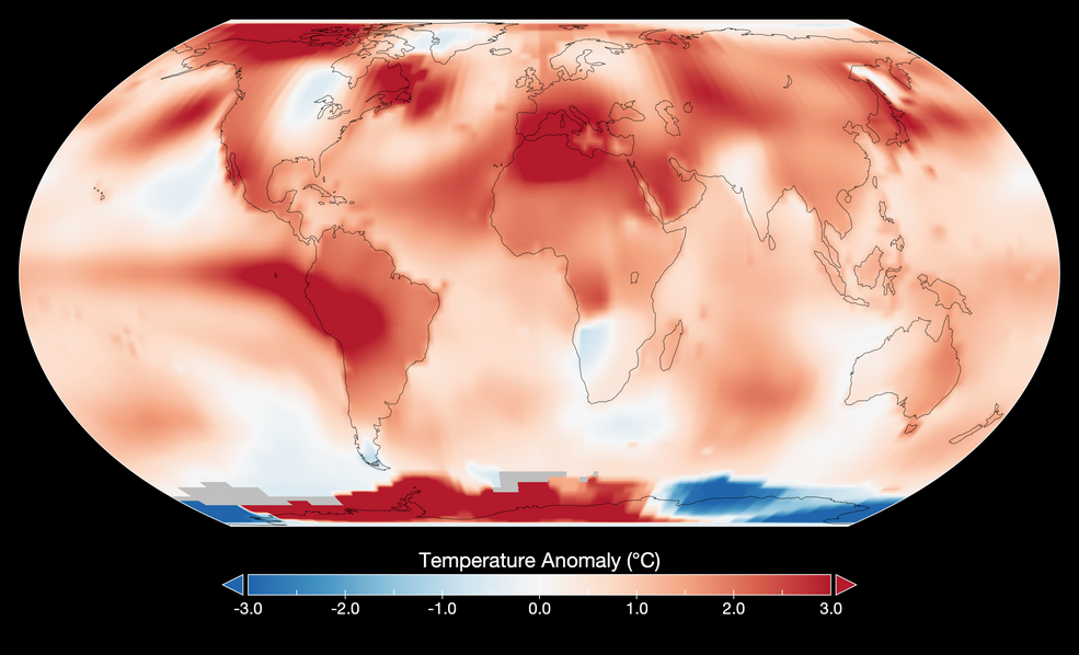
NASA reported July 2023 as Hottest Month on Record Ever Since 1880
In this section, we will analyze drought patterns in the United States using the 4-km Gridded Surface Meteorological (GRIDMET) dataset, which contains drought indices such as the standardized precipitation index (SPI), the evaporative drought demand index (EDDI), the standardized precipitation evapotranspiration index (SPEI), the Palmer Drought Severity Index (PDSI) and Palmer Z Index (Z). The GRIDMET dataset is available from 1980 to the present. The dataset is updated every 5 days and has a spatial resolution of 4 km.
Let's filter the GRIDMET dataset to the year of 2023 and visualize the PDSI index for the month of July 2023.
Print out the GRIDMET dataset ids, which contain the date information in the YYYYMMDD format.
Create a mean GRIDMET image for the month of July 2023.
Visualize the GRIDMET dataset for the month of July 2023.

You can compare the GRIDMET PDSI map for July 2023 with the map of historical Palmer Drought Severity Index (PDSI) from NECI.

Let's select a county in the United States and extract the historical PDSI and SPI values. You can place a marker on the map to select a county. If no county is selected, the default county is set to the Clark County, Nevada, which includes the city of Las Vegas. We will extract the PDSI and SPI values for the selected county and create a time series chart.
Create a monthly time series of PDSI for the selected county.
Create a monthly time series of SPI for the selected county.
Note that both the PDSI and SPI time series have 534 images, which represent the monthly values from January 1980 to June 2024. Let's select the month of March 2021 and visualize the PDSI and SPI values for the selected county.
Calculate the monthly mean PDSI for the selected county.
Calculate the monthly mean SPI for the selected county.
Read the PDSI values from the output csv and transform the data to a pandas DataFrame with a pdsi column.
Read the SPI values from the output csv and transform the data to a pandas DataFrame with a spi column.
Combine the PDSI and SPI data into a single DataFrame with pdsi, spi, and date columns.
Create a bar chart for showing the historical PDSI values for the selected county.

Create a bar chart for showing the historical SPI values for the selected county.

Show the combined PDSI and SPI values in a single chart.

Exercise - Analyzing drought data for a selected county
Select a county in the United States and extract the historical PDSI values. Create a time series chart to visualize the PDSI values for the selected county.
Analyzing and visualizing precipitation data
Exploring precipitation datasets
The Earth Engine Public Data Catalog hosts a lot of precipitation datasets, including:
Calculating Standardized Precipitation Index (SPI)
The Standardized Precipitation Index (SPI) is a widely used index to characterize meteorological drought on a range of timescales. On short timescales, the SPI is closely related to soil moisture, while at longer timescales, the SPI can be related to groundwater and reservoir storage. The SPI can be compared across regions with markedly different climates. It quantifies observed precipitation as a standardized departure from a selected probability distribution function that models the raw precipitation data. The raw precipitation data are typically fitted to a gamma or a Pearson Type III distribution, and then transformed to a normal distribution. The SPI values can be interpreted as the number of standard deviations by which the observed anomaly deviates from the long-term mean. The SPI can be created for differing periods of 1-to-36 months, using monthly input data.
The SPI is calculated as follows:
SPI = (P-P*) / σp
where P = precipitation, p* = mean precipitation, and σp = standard deviation of precipitation.
In this section, we will use the PRISM Daily Spatial Climate Dataset to calculate the SPI. It has daily precipitation data from 1981 to present with a spatial resolution of 4 km. The dataset is based on the Parameter-elevation Regressions on Independent Slopes Model (PRISM) and is available from the Oregon State University PRISM Climate Group.
Let's filter the PRISM dataset to the month of July 2023 and calculate the total precipitation for the month.

Create monthly precipitation images from 1981 to 2024.
Calculate the long-term mean precipitation and standard deviation of precipitation.
Calculate the SPI for the month of July 2023.
Visualize the SPI for the month of July 2023.

Exercise - Calculating SPI for a selected region
Select a region in the United States and calculate the SPI for the region using the PRISM dataset. Visualize the SPI for the region.