Graphics using R in the Sagemath Cloud
This is a Sagemath Cloud worksheet version of Frank McCown's tutorial from http://www.harding.edu/fmccown/r/. First, we put the worksheet into R mode (otherwise you would have to type %r at the beginning of each cell):Line Charts
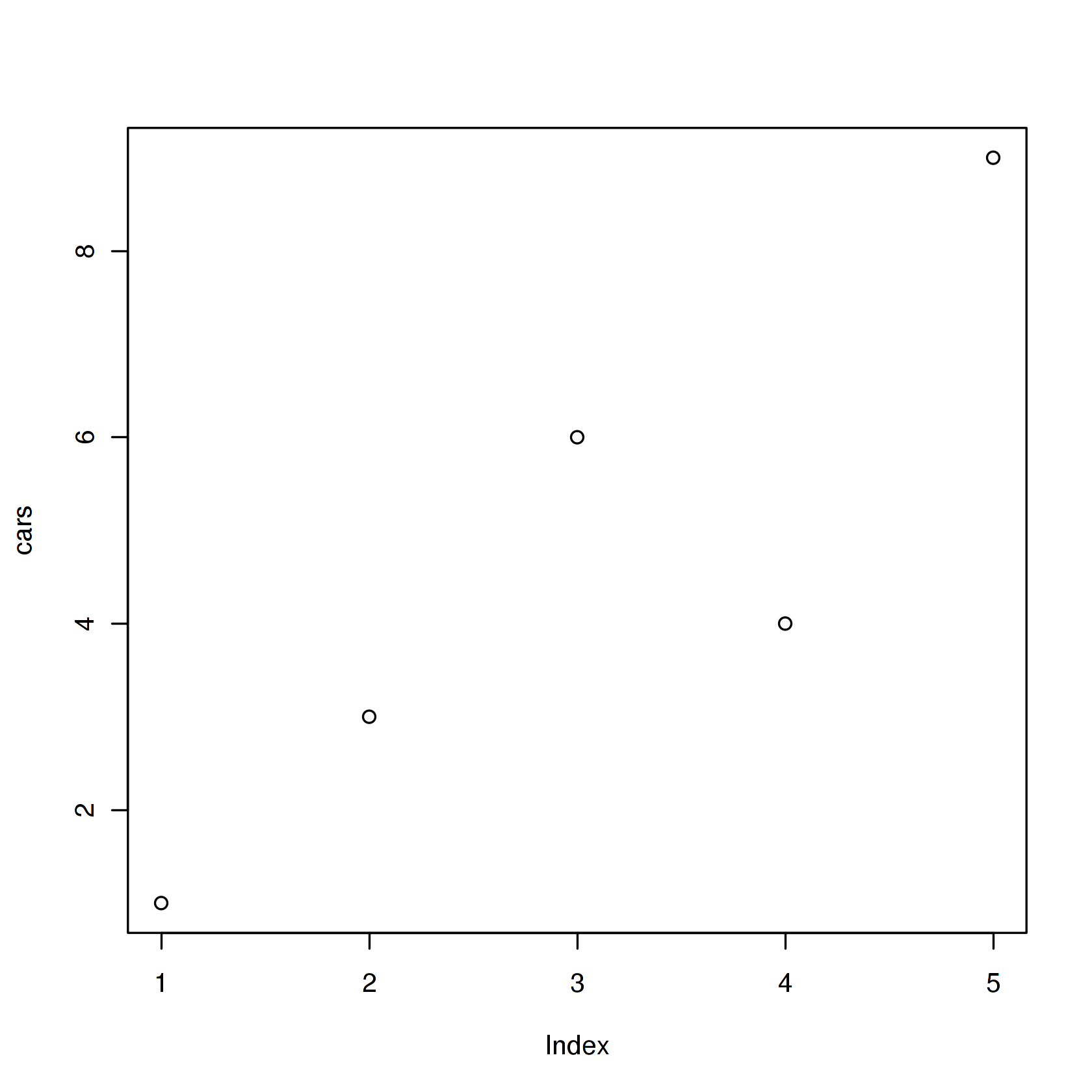
First we'll produce a very simple graph using the values in the car vector:
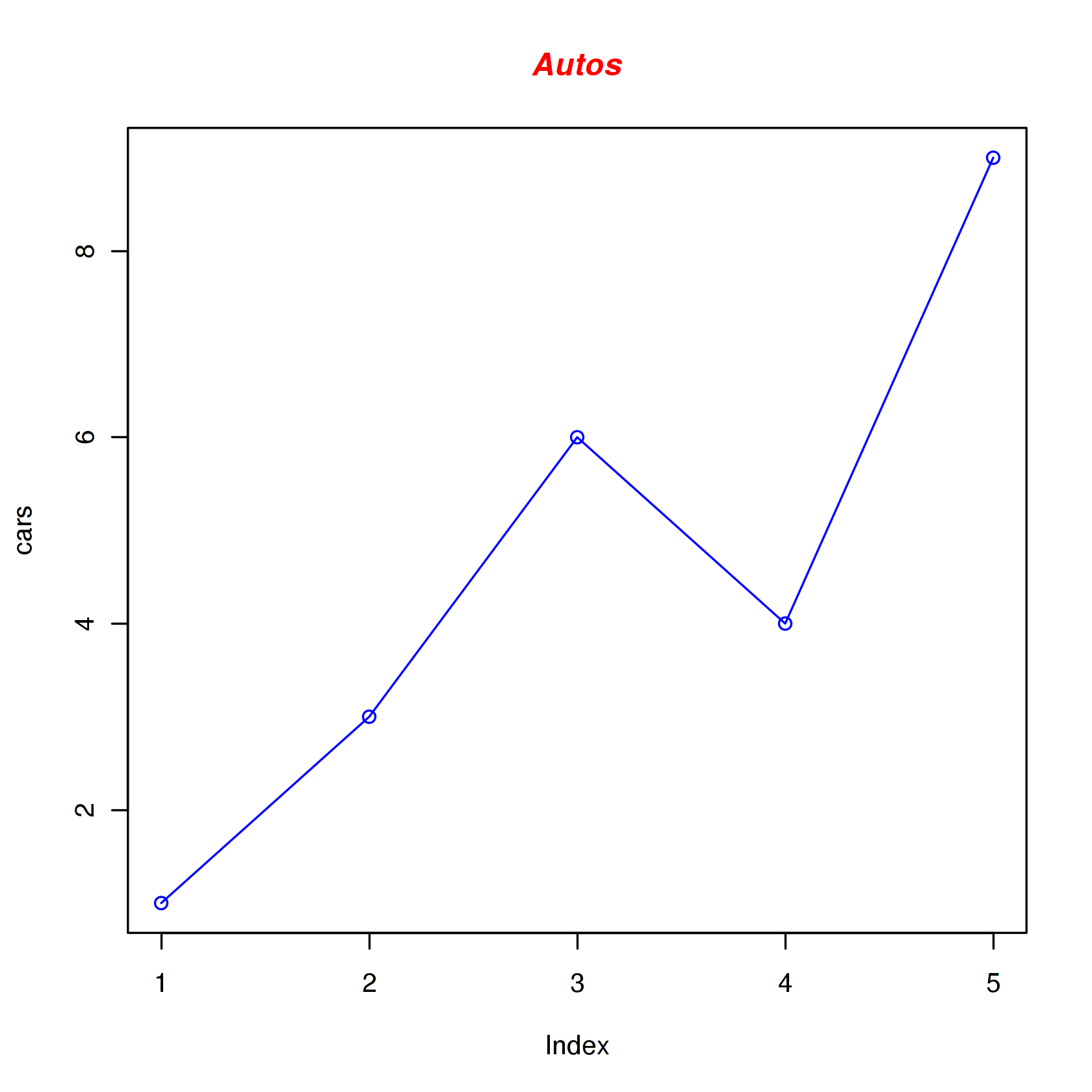
Let's add a title, a line to connect the points, and some color:
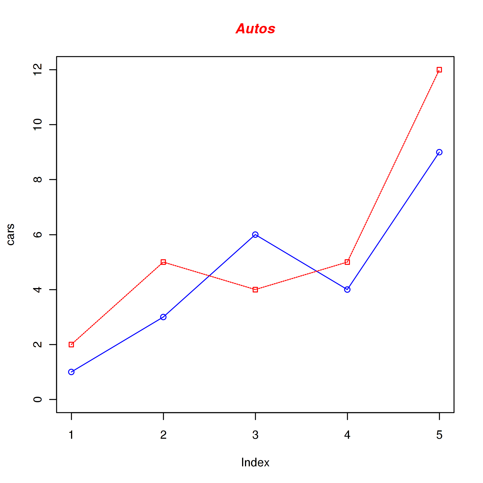
Now let's add a red line for trucks and specify the y-axis range directly so it will be large enough to fit the truck data:
Next let's change the axes labels to match our data and add a legend. We'll also compute the -axis values using the max function so any changes to our data will be automatically reflected in our graph.
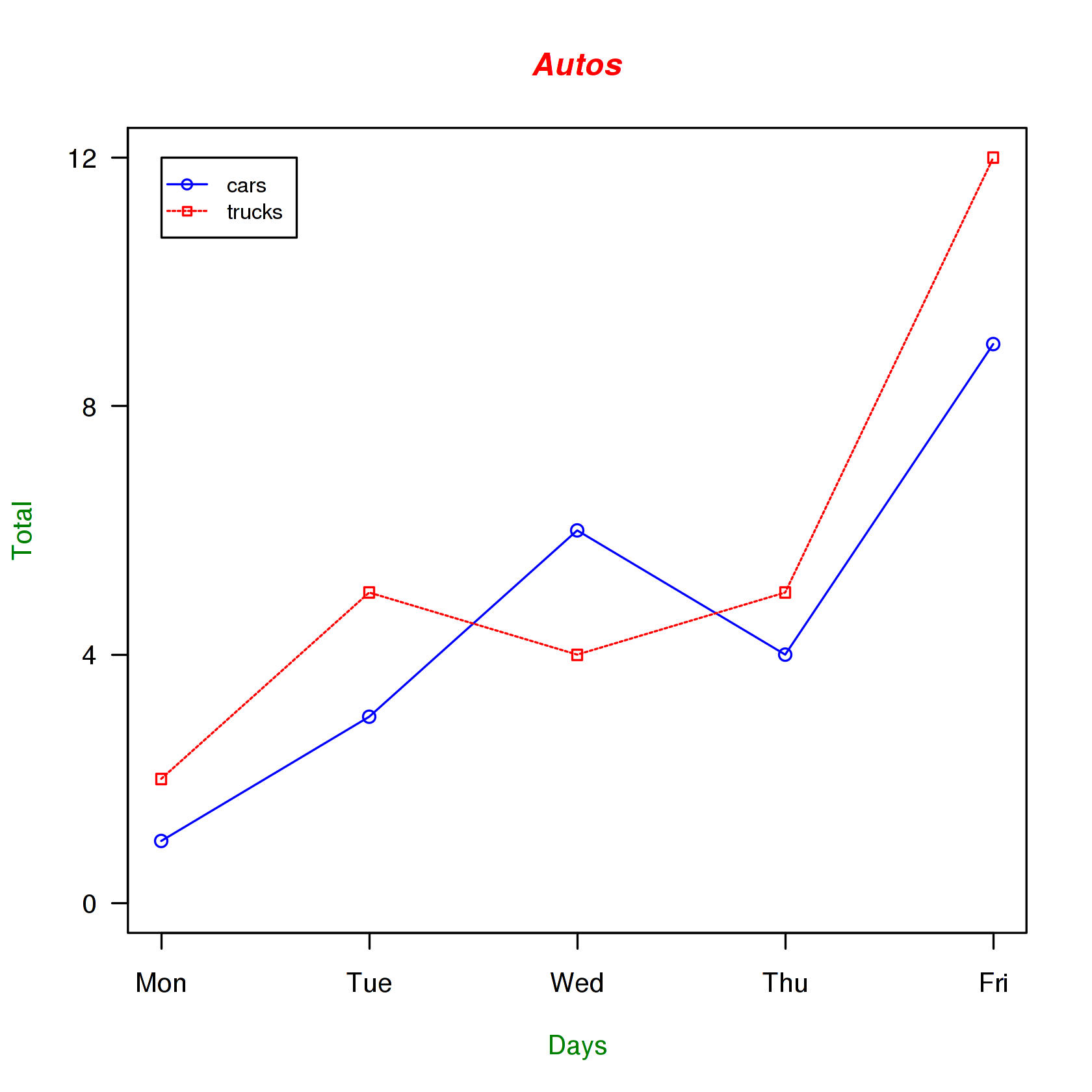
Now let's read the graph data directly from a tab-delimited file. The file contains an additional set of values for SUVs. We'll create the file using the `%sage_saluvs.file cell decorator:
We'll also use a vector for storing the colors to be used in our graph so if we want to change the colors later on, there's only one place in the file that needs to be modified. Finally we'll send the figure directly to a PNG file. (You can also instead just right click on a figure embedded in the worksheet and click save as if you want.)
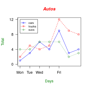
In this next example, we'll save the file to a PDF and chop off extra white space around the graph; this is useful when wanting to use figures in LaTeX (and cloud.sagemath has a very nice integrated latex development environment!). We'll also increase the line widths, shrink the axis font size, and tilt the x-axis labels by 45 degrees.
We can directly look at the figure in the worksheet (you can also navigate to the pdf file andclick to view it).

Embedding the generated PDF plot inside a document.
After running this cell, open r-plot.tex to compile it.
Bar Charts
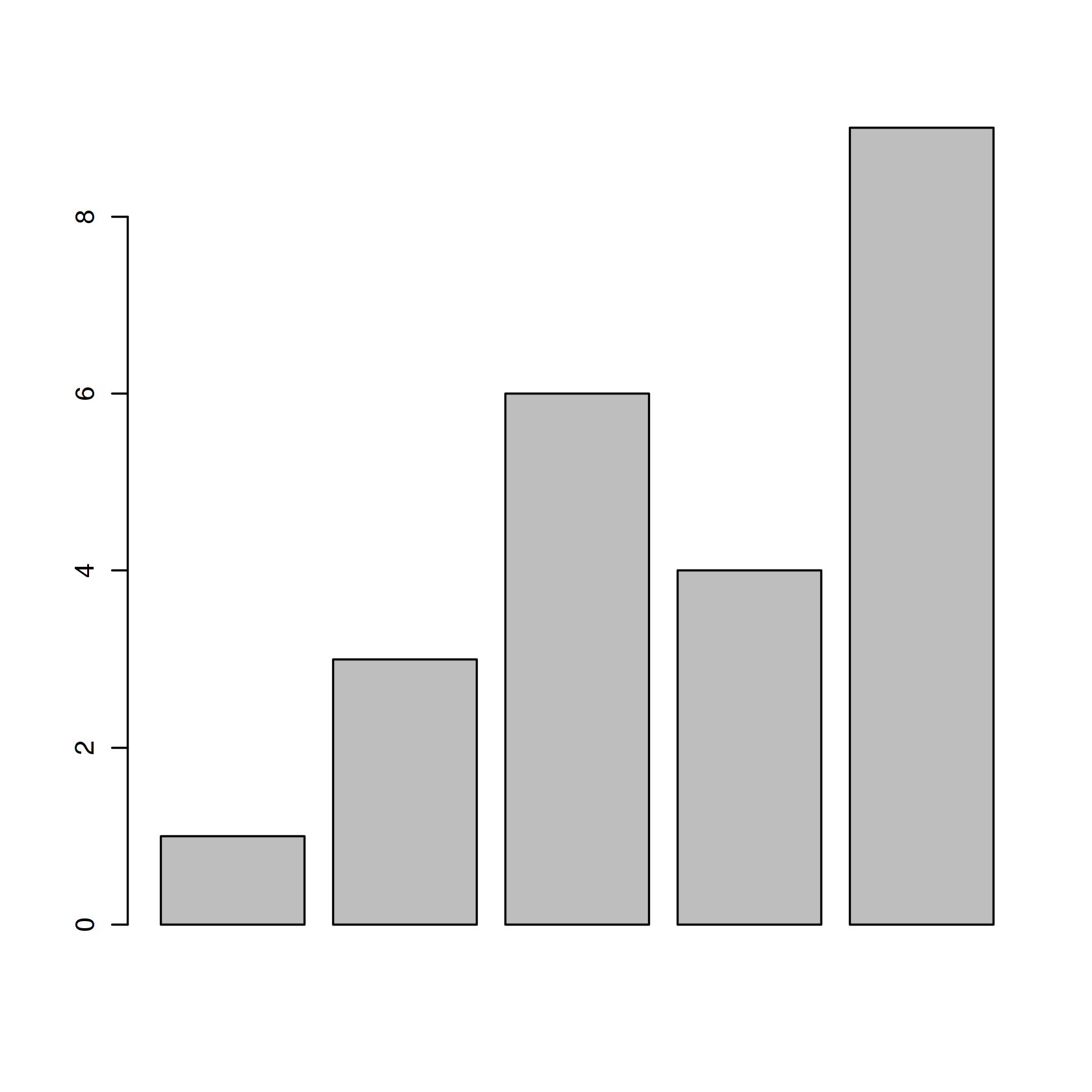
Let's start with a simple bar chart graphing the cars vector:
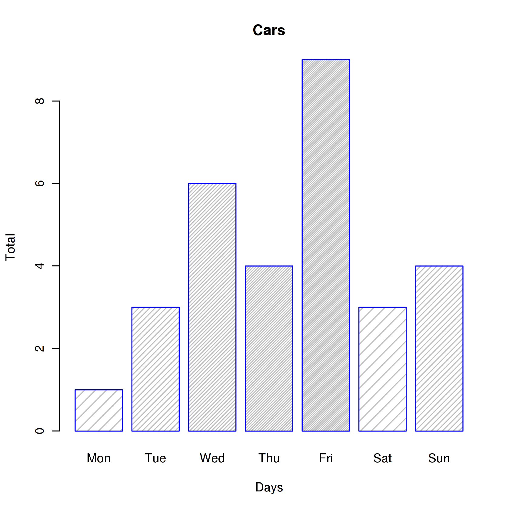
Let's now read the auto data from the autos.dat data file, add labels, blue borders around the bars, and density lines:
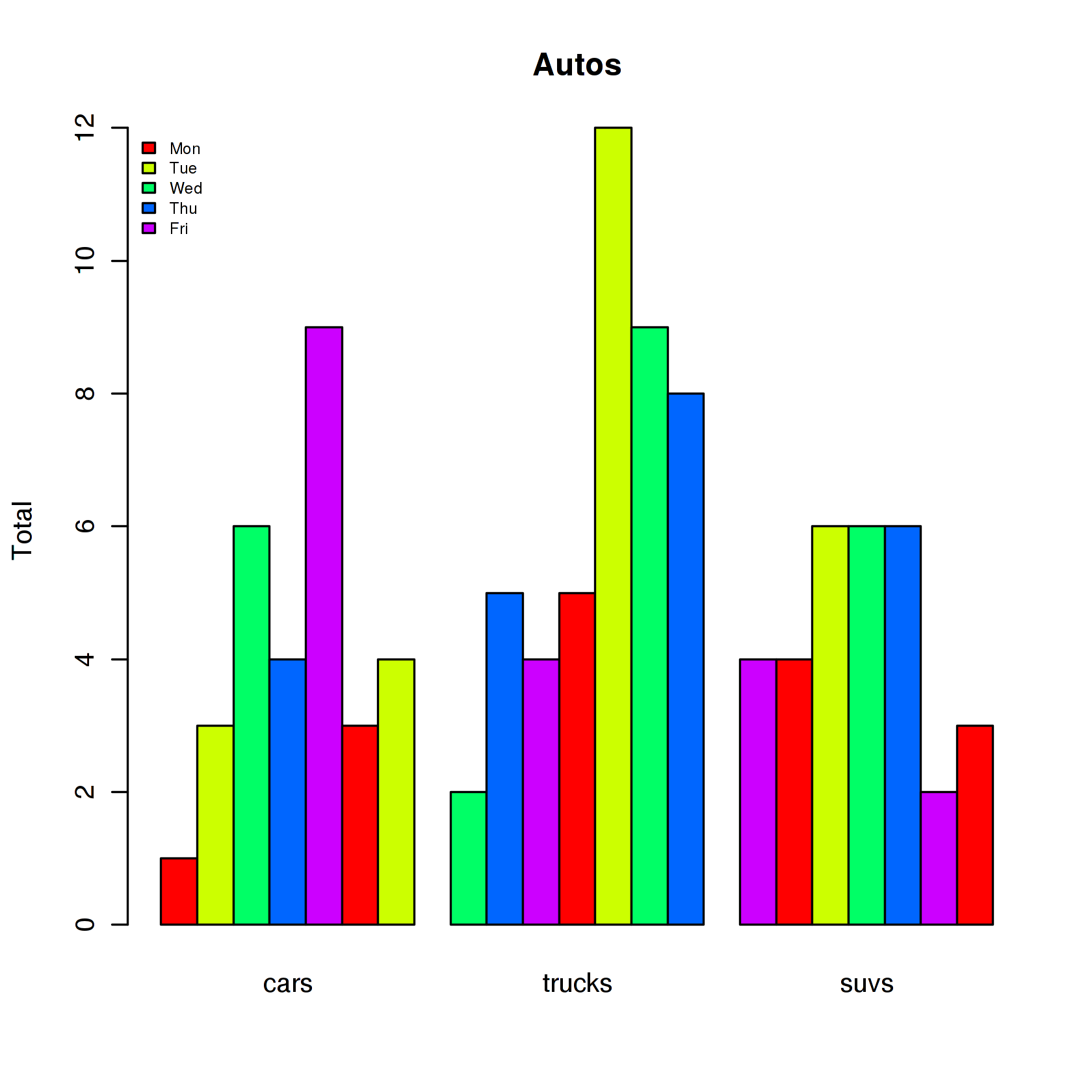
Now let's graph the total number of autos per day using some color and show a legend:
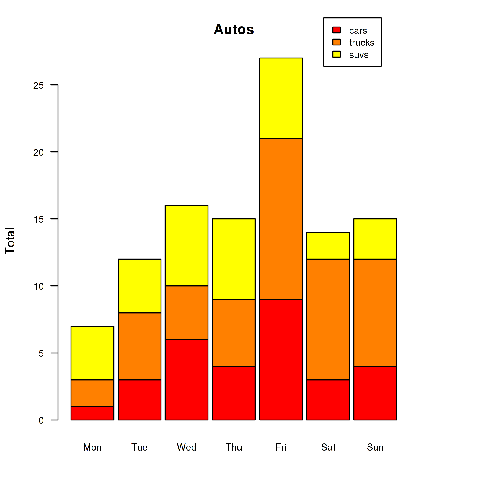
Let's graph the total number of autos per day using a stacked bar chart and place the legend outside of the plot area:
Histograms
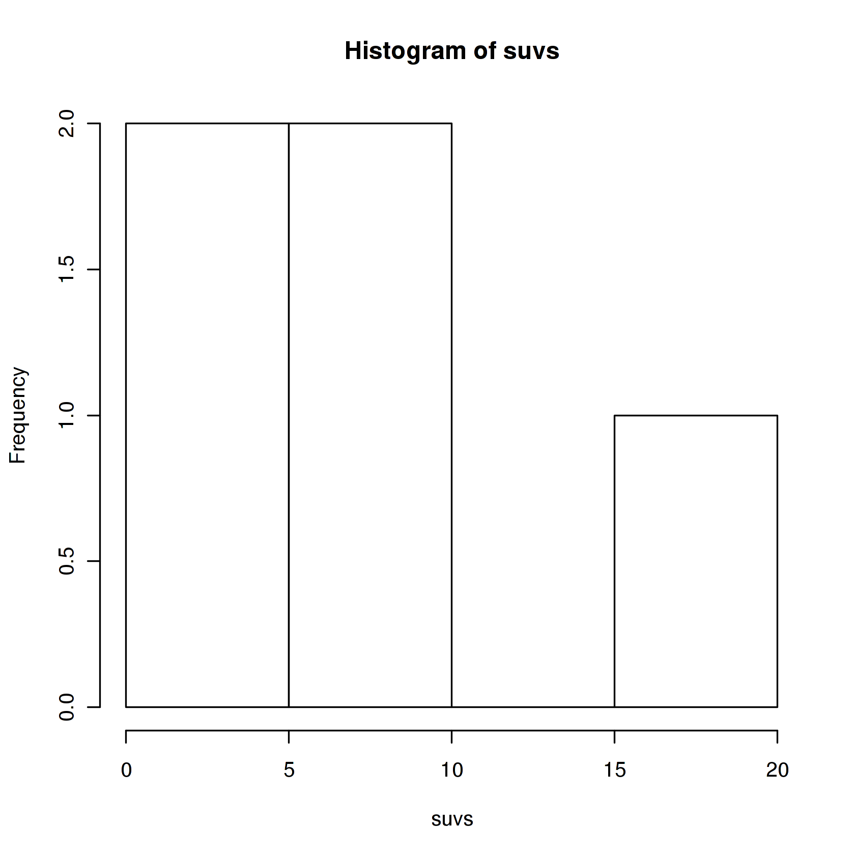
Let's start with a simple histogram graphing the distribution of the suvs vector:
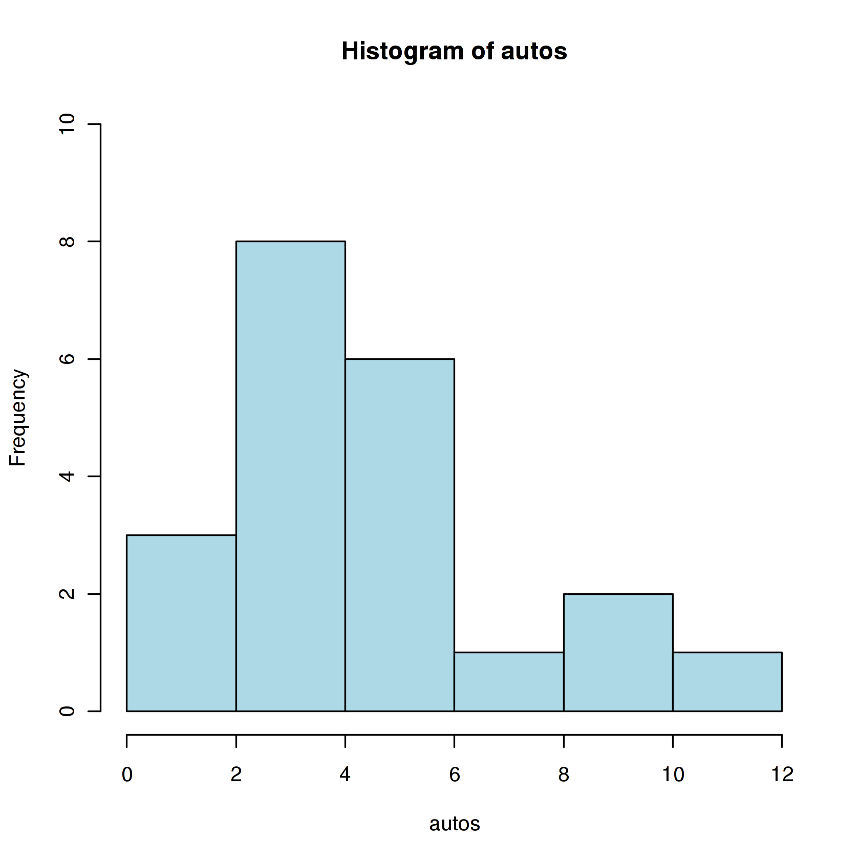
Let's now read the auto data from the autos.dat data file and plot a histogram of the combined car, truck, and suv data in color.
Now change the breaks so none of the values are grouped together and flip the y-axis labels horizontally.
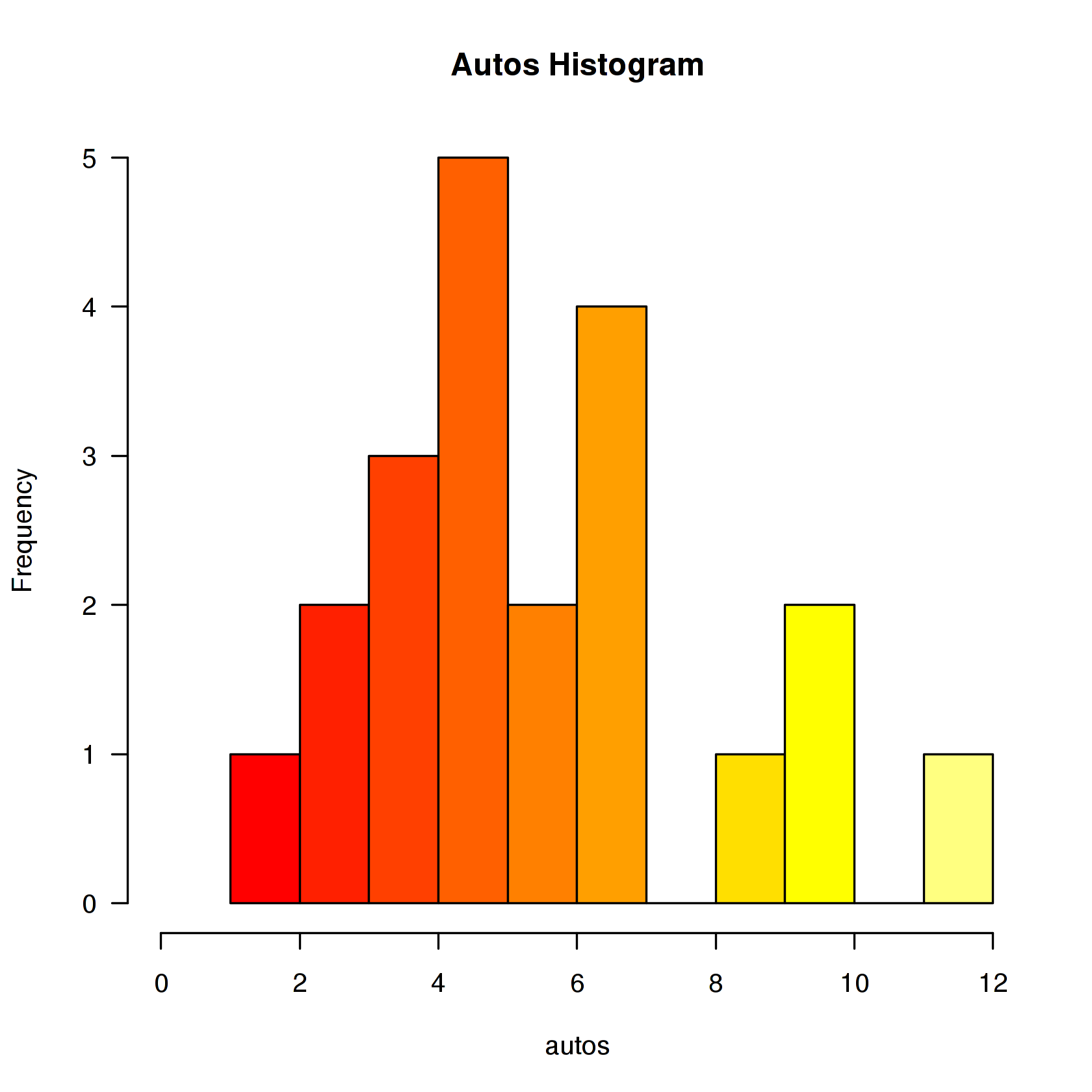
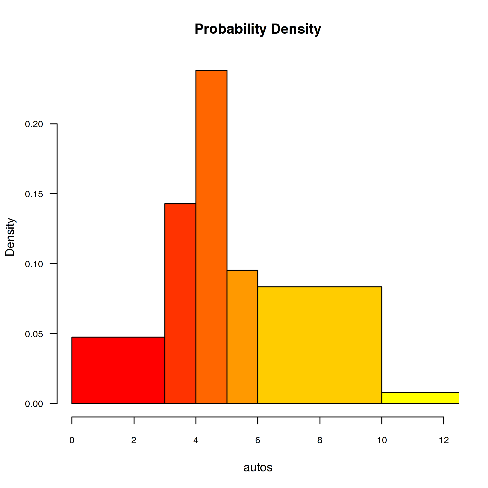
Now let's create uneven breaks and graph the probability density.
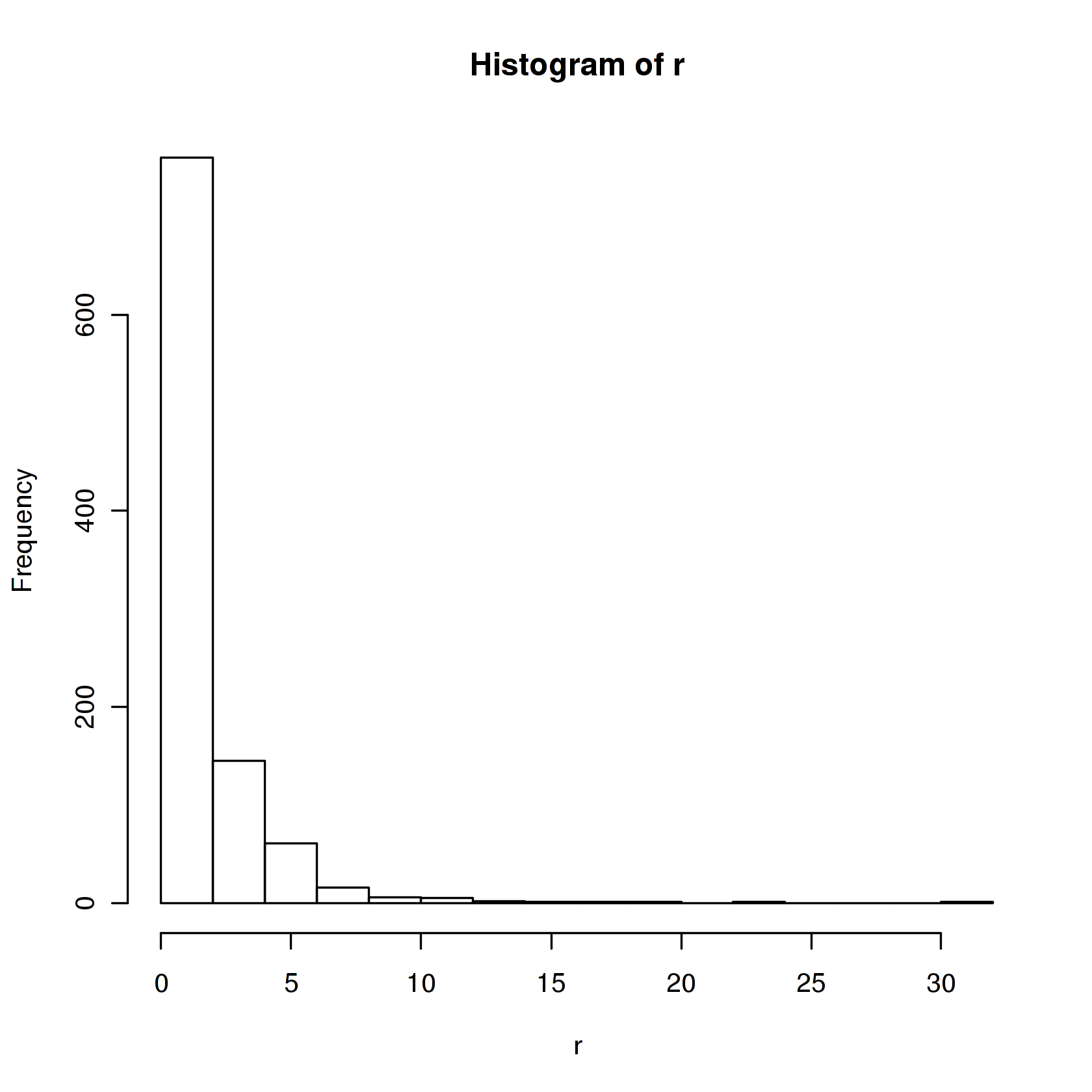
In this example we'll plot the distribution of 1000 random values that have the log-normal distribution.
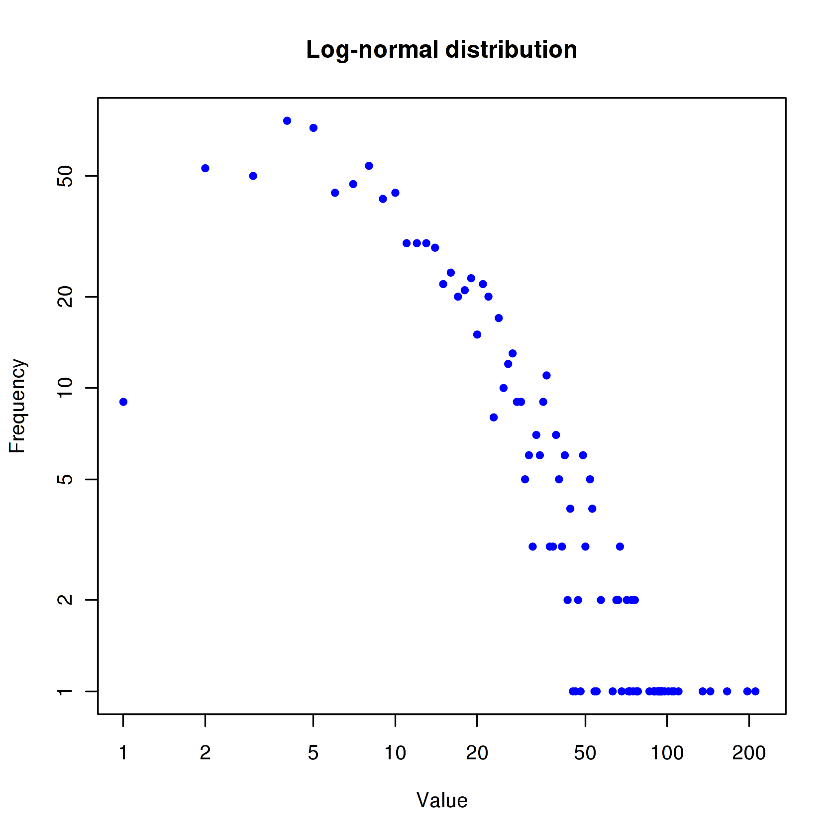
Since log-normal distributions normally look better with log-log axes, let's use the plot function with points to show the distribution.
Pie Charts
Let's start with a simple pie chart graphing the cars vector:
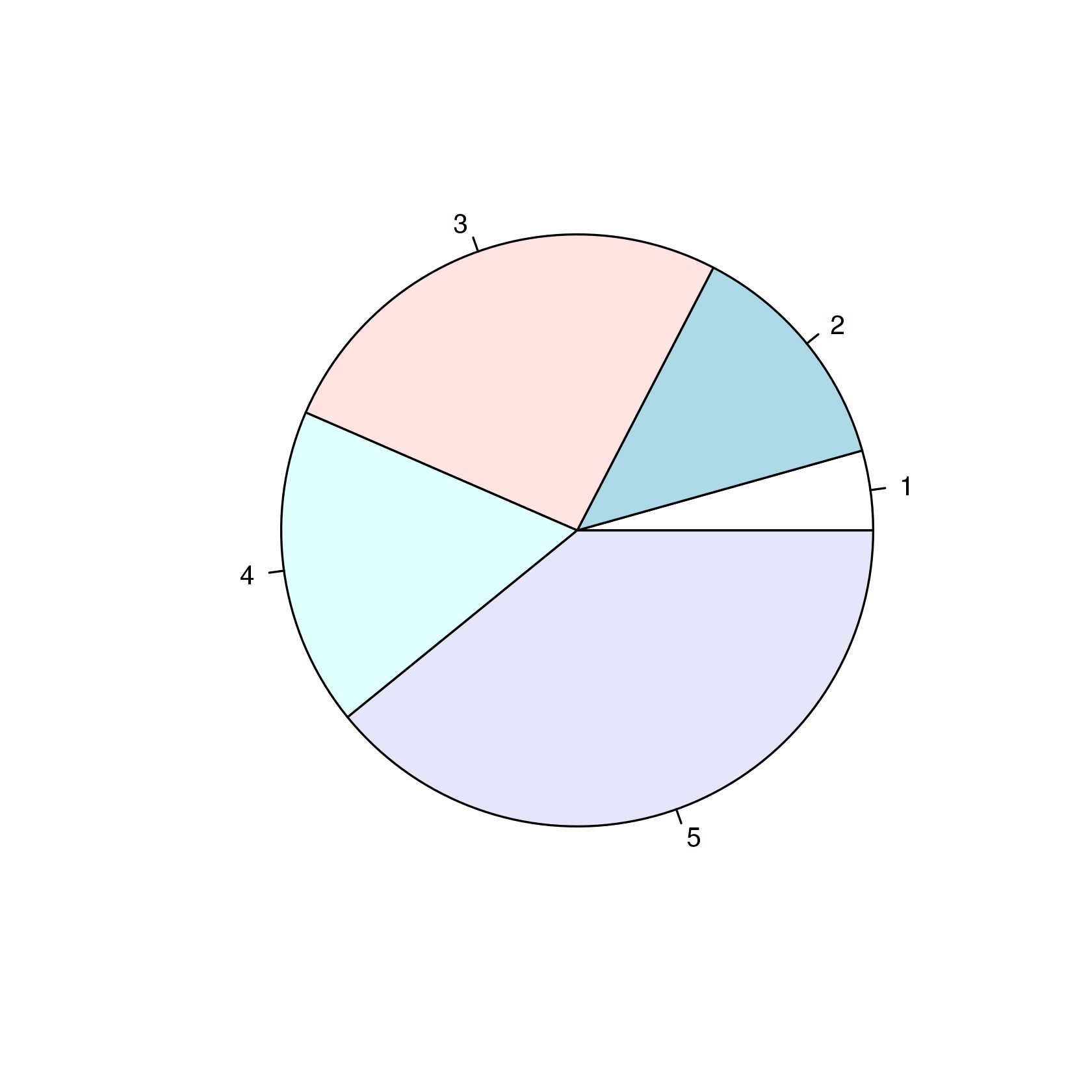
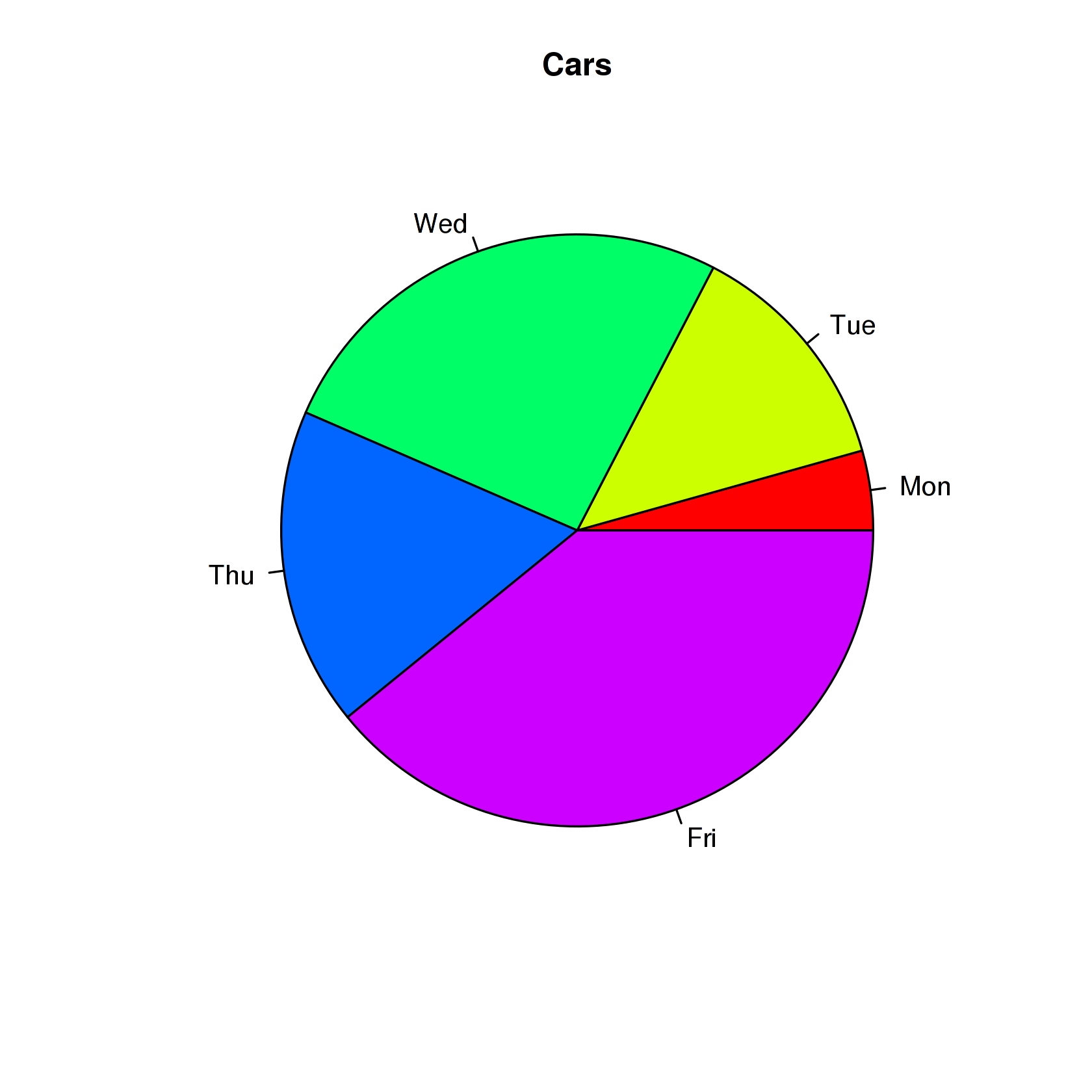
Now let's add a heading, change the colors, and define our own labels:
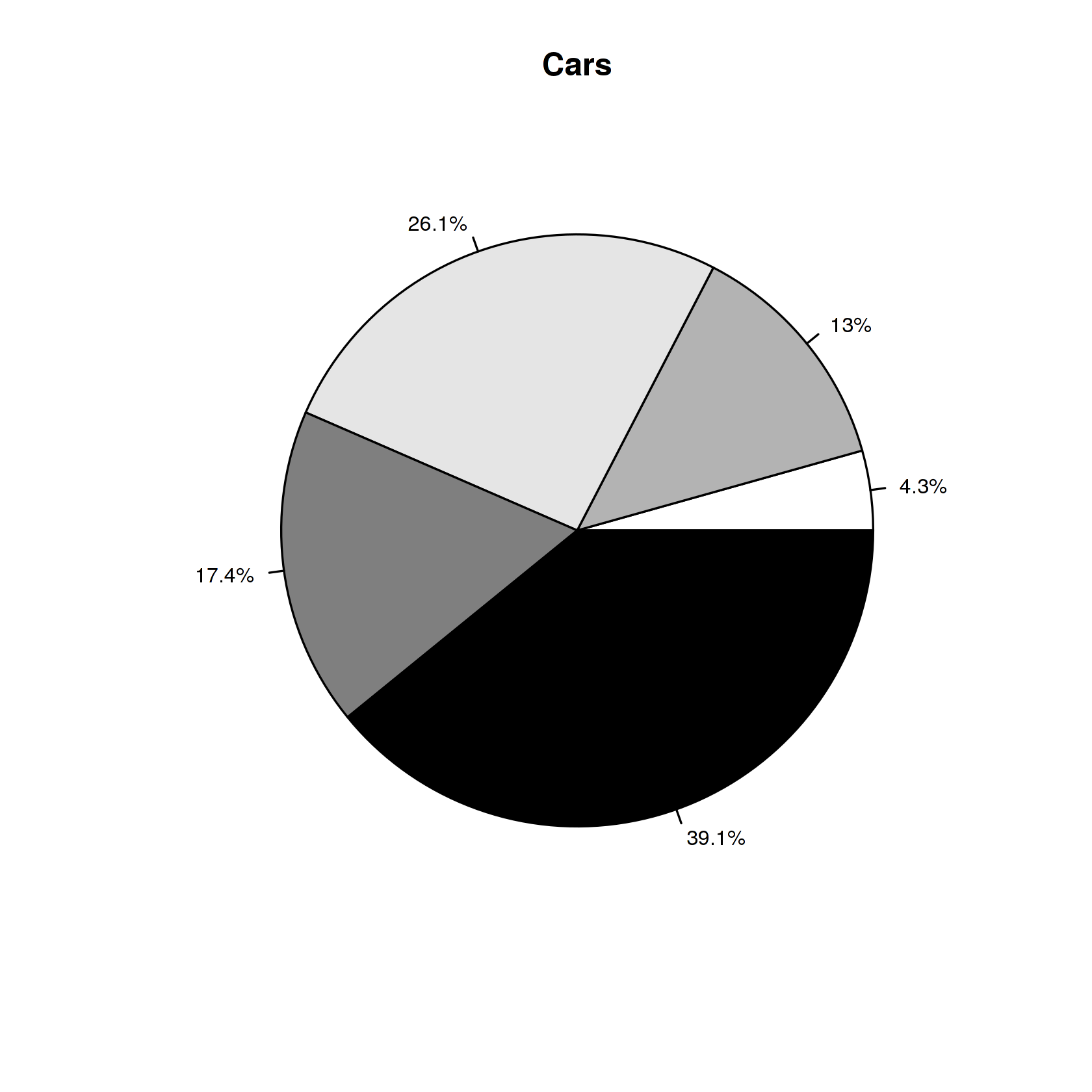
Now let's change the colors, label using percentages, and create a legend:
Dotcharts
Let's start with a simple dotchart graphing the autos data:
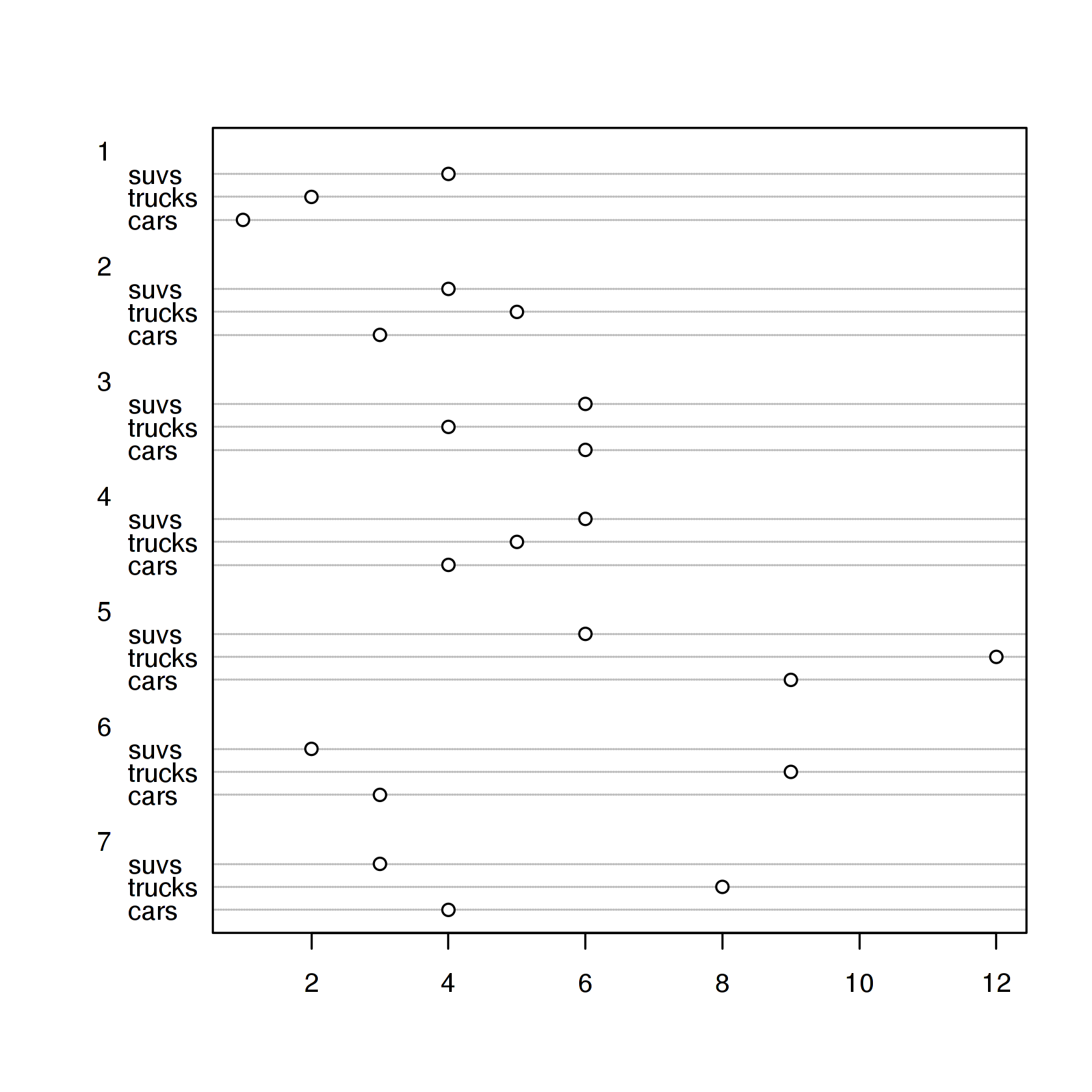
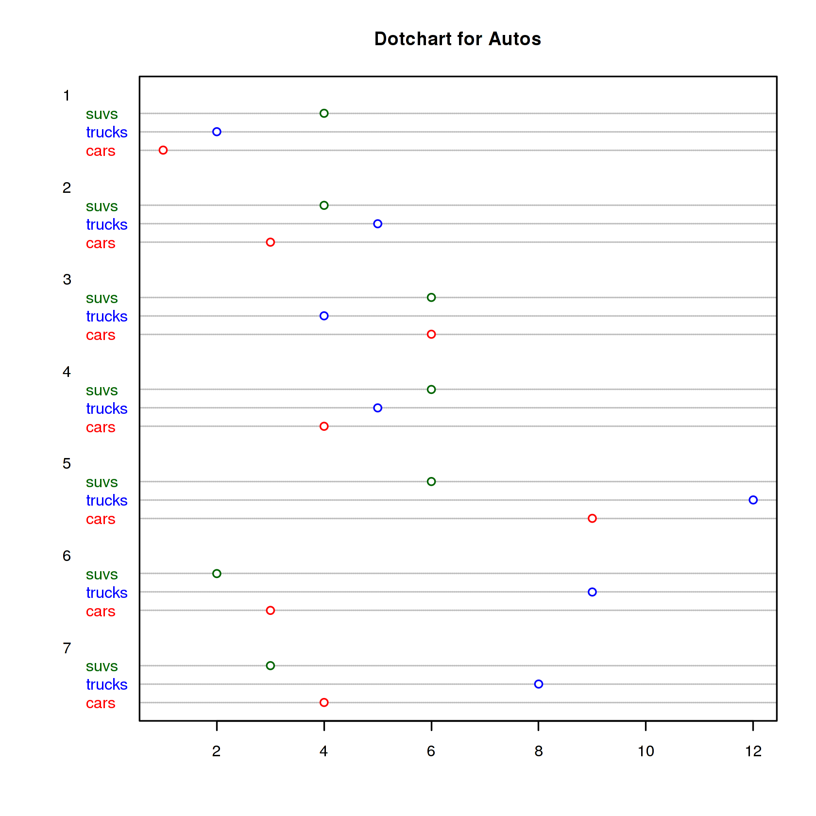
Let's make the dotchart a little more colorful:
Misc
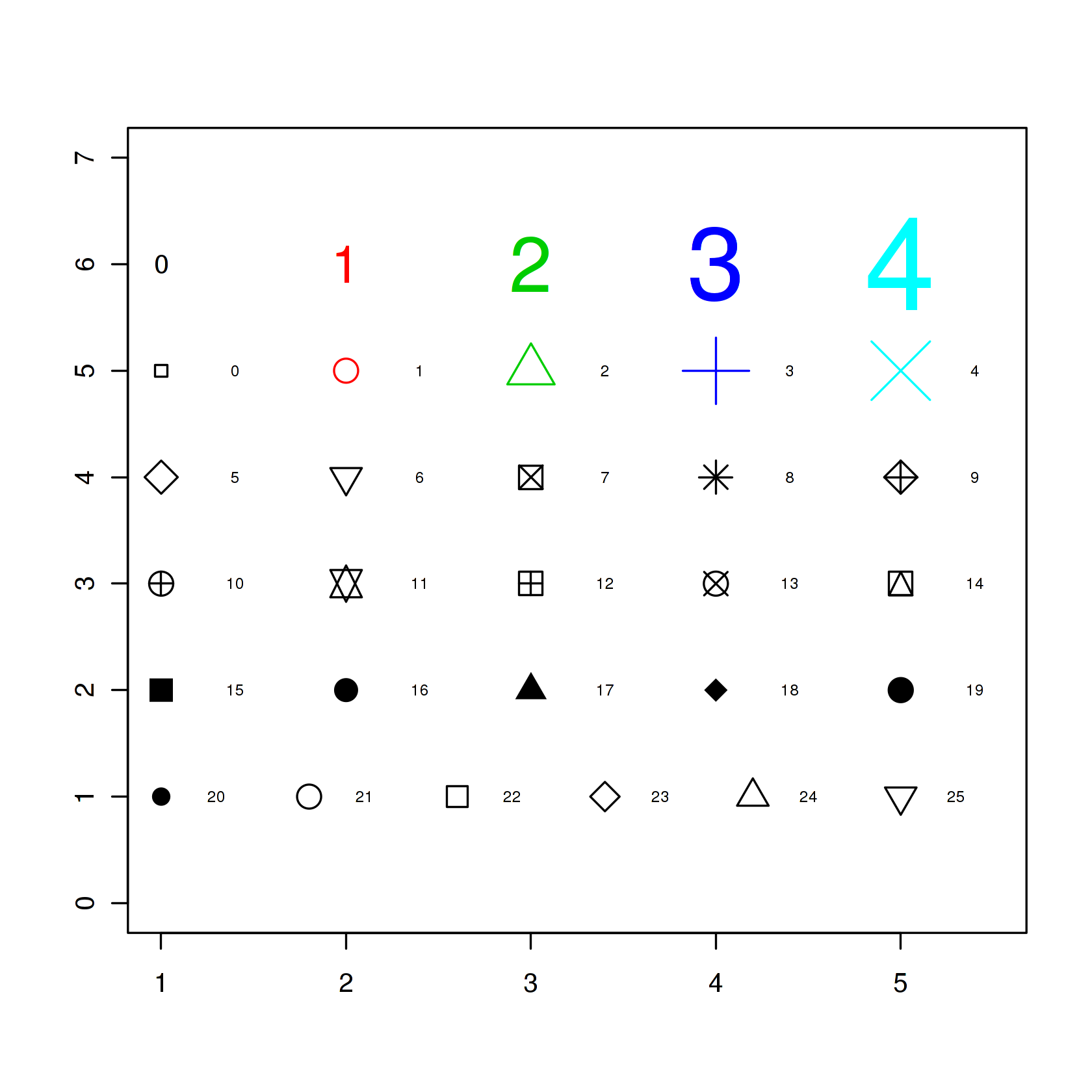
This example shows all 25 symbols that you can use to produce points in your graphs:
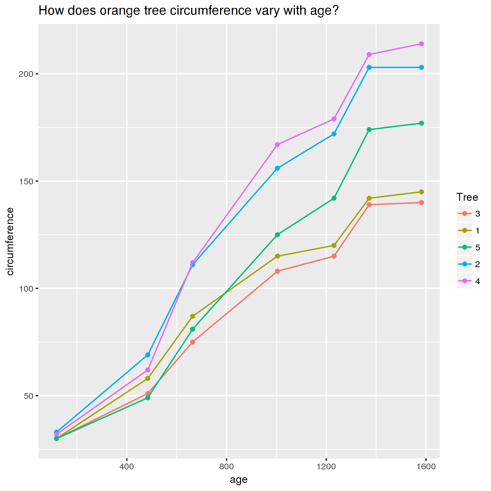
Bonus -- you can also use ggplot2
