
Path: blob/master/Data Analytics Using Python/4 Titanic EDA(final) and Modelling.ipynb
4751 views
EDA Project on "The Titanic Wreck"
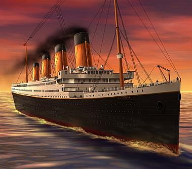
Table of Contents
Data Profiling & Preprocessing
3.1 Pre Profiling
3.2 Preprocessing
3.3 Post Profiling
Objective
The objective here is to conduct Exploratory data analysis (EDA) on the Titanic Dataset in order to gather insights and evenutally predicting survior on basics of factors like Class ,Sex , Age , Gender ,Pclass etc.
Why EDA?
An approach to summarize, visualize, and become intimately familiar with the important characteristics of a data set.
Defines and Refines the selection of feature variables that will be used for machine learning.
Helps to find hidden Insights
It provides the context needed to develop an appropriate model with minimum errors
About Event
The RMS Titanic was a British passenger liner that sank in the North Atlantic Ocean in the early morning hours of 15 April 1912, after it collided with an iceberg during its maiden voyage from Southampton to New York City. There were an estimated 2,224 passengers and crew aboard the ship, and more than 1,500 died, making it one of the deadliest commercial peacetime maritime disasters in modern history. This sensational tragedy shocked the international community and led to better safety regulations for ships.

2. Data Description
The dataset consists of the information about people boarding the famous RMS Titanic. Various variables present in the dataset includes data of age, sex, fare, ticket etc. The dataset comprises of 891 observations of 12 columns. Below is a table showing names of all the columns and their description.
| Column Name | Description |
|---|---|
| PassengerId | Passenger Identity |
| Survived | Survival (0 = No; 1 = Yes) |
| Pclass | Passenger Class (1 = 1st; 2 = 2nd; 3 = 3rd) |
| Name | Name of passenger |
| Sex | Sex of passenger |
| Age | Age of passenger |
| SibSp | Number of siblings and/or spouses travelling with passenger |
| Parch | Number of parents and/or children travelling with passenger |
| Ticket | Ticket number |
| Fare | Price of ticket |
| Cabin | Cabin number |
| Embarkment | Port of Embarkation (C = Cherbourg; Q = Queenstown; S = Southampton) |
Import necessary modules
Importing Data
Examining Data
Relevant features to check survival probability:
Age, Fare, (Person_type(Infant,Adults,Young, Old))
Statistical Summary about Data
Insights:
1.Total samples are 891 or 40% of the actual number of passengers on board the Titanic (2,224)
2.Survived is a categorical feature with 0 or 1 values
3.Around 38% samples survived representative of the actual survival rate at 32%
4.Fares varied significantly with few passengers (<1%) paying as high as $512.
5.Few elderly passengers (<1%) within age range 65-80.
6.More number of Male passengers
7.More travellers were Embarked form S
Data Preprocessing
Check for Errors and Null Values
Replace Null Values with appropriate values
Drop down features that are incomplete and are not too relevant for analysis
Create new features that can would help to improve prediction
Check for null or empty values in Data
The Age, Cabin and Embarked have null values.Lets fix them
Filling missing age by median ## Median is not affected by Outliers
Filling missing Embarked by mode
Cabin feature may be dropped as it is highly incomplete or contains many null values
PassengerId Feature may be dropped from training dataset as it does not contribute to survival
Ticket feature may be dropped down
Feature Engineering:Creating New Fields
Create New Age Bands to improve prediction Insights
Create a new feature called Family based on Parch and SibSp to get total count of family members on board
Create a Fare range feature if it helps our analysis
AGE-BAND
Fare-Band
Extracting Titles Now we can drop down Name feature
We can also create an artificial feature combining Pclass and Age.
Data Visualization to describe and understand data
4.1 What is Total Count of Survivals and Victims?
Insight- 549 passengers died and 342 Passengers managed to survive

Insights
Only 342 Passengers Survived out of 891
Majority Died which conveys there were less chances of Survival
4.2 Which gender has more survival rate?

Insights
Female has better chances of Survival "LADIES FIRST"
There were more males as compared to females ,but most of them died.
4.3 What is Survival rate based on Person type?

More number of Adult travellers as compared to children and Infant


------------------------------------------CHILD-SURVIVAL RATE--------------------------------------------------------------

Insights
Majority Passengers were Adults
Almost half of the total number of children survived.
Most of the Adults failed to Survive
More than 85percent of Infant Survived
4.4 Did Economy Class had an impact on survival rate?

Insights
Most of the passengers travelled in Third class but only 24per of them survived
If we talk about survival ,more passengers in First class survived and again female given more priority
Economic Class affected Survival rate and Passengers travelling with First Class had higher ratio of survival as compared to Class 2 and 3.
4.5 What is Survival Propability based on Embarkment of passengers?
Titanic’s first voyage was to New York before sailing to the Atlantic Ocean it picked passengers from three ports Cherbourg(C), Queenstown(Q), Southampton(S). Most of the Passengers in Titanicic embarked from the port of Southampton.Lets see how embarkemt affected survival probability.

4.6 How is Fare distributed for Passesngers?

Insights
Majority Passenger's fare lies in 0-100 dollars range
Passengers who paid more Fares had more chances of Survival
Fare as high as 514 dollars was purcharsed by very few.(Outlier)
4.7 What was Average fare by Pclass & Embark location?

Insights
First Class Passengers paid major part of total Fare.
Passengers who Embarked from Port C paid Highest Fare
4.8 Segment Age in bins with size of 10

Insights:
The youngest passenger on the Titanic were toddlers under 6 months
The oldest were of 80 years of age.
The mean for passengers was a bit over 29 years i.e there were more young passengers in the ship.
Lets see how Age has correlation with Survival


Insights
Most of the passengers died.
Majority of passengers were between 25-40,most of them died
Female are more likely to survival
4.9 Did Solo Passenger has less chances of Survival ?
Insights
Most of the Passengers were travelling Solo and most of them died
Solo Females were more likely to Survive as compared to males
Passengers Class have a positive correlation with Solo Passenger Survival
Passengers Embarked from Port Q had Fifty -Fifty Chances of Survival
4.10 How did total family size affected Survival Count?

Insights
Both men and women had a massive drop of survival with a FamilySize over 4.
The chance to survive as a man increased with FamilySize until a size of 4
Men are not likely to Survive with FamilySize 5 and 6
Big Size Family less likihood of Survival
Insights:
Older women have higher rate of survival than older men . Also, older women has higher rate of survival than younger women; an opposite trend to the one for the male passengers.
All the features are not necessary to predict Survival
More Features creates Complexitity
Fare has positive Correlation
For Females major Survival Chances , only for port C males had more likeihood of Survival.
Conclusion : "If you were young female travelling in First Class and embarked from port -C then you had best chances of Survival in Titanic"
Most of the Passengers Died
"Ladies & Children First" i.e 76% of Females and 16% of Children Survived
Gender , Passenger type & Classs are mostly realted to Survival.
Survival rate diminishes significantly for Solo Passengers
Majority of Male Died
Males with Family had better Survival rate as compared to Solo Males
Part 2 Data Modelling
Data Modeling in Machine Learning
What is Data Modeling?
Data Modeling in machine learning refers to the process of using algorithms to find patterns in data and build models that can predict, classify, or generate outputs from new inputs.
It involves:
Selecting a modeling technique (Regression, Classification, etc.)
Training the model on historical data
Evaluating and refining it for accurate predictions
Data Modeling typically falls under Supervised, Unsupervised, or Reinforcement Learning, with most business cases using Supervised Learning (Classification/Regression).
Types of Data Modeling
1. Regression
Goal: Predict continuous numerical values.
Target Variable: Continuous (e.g., price, temperature, income).
Example Use Cases:
Predicting house prices
Estimating annual salary
Forecasting sales
2.Classification
Goal: Predict categorical values.
Target Variable: Categorical (e.g., Yes/No, 0/1, A/B/C).
Example Use Cases:
Email Spam detection
Predicting if a customer will churn
Diagnosing disease (positive/negative)
3.Clustering (Unsupervised)
Goal: Group similar items without labeled output.
Example Use Cases:
Customer segmentation
Document grouping
Anomaly detection
Logistic Regression
is a supervised machine learning algorithm used for classification problems.
It estimates the probability that a given input point belongs to a particular category.
Binary Logistic Regression
Used when the dependent variable (Y) has two classes (e.g., Survived: 0 or 1) 
Sigmoid Curve (Graph)
A logistic regression model outputs probabilities between 0 and 1, shaped like an S-curve (sigmoid):

Binary Classification Decision Rule
If ( P(y=1|x) > 0.5 ), predict class 1
Else, predict class 0
This threshold can be tuned depending on the problem (e.g., 0.7 or 0.3).
Multiclass Logistic Regression
Used when the target variable has 3 or more categories (e.g., Cat, Dog, Rabbit).
Softmax Function:
[ P(y = k | x) = \frac{e^{\beta_k^T x}}{\sum_{j=1}^{K} e^{\beta_j^T x}} ]
Where:
( K ): Total number of classes
( \beta_k ): Coefficients for class ( k )
Output: Probabilities for all classes (summing to 1)
Binary vs Multiclass Logistic Regression: Comparison
| Feature | Binary Logistic Regression | Multiclass Logistic Regression |
|---|---|---|
| Target Classes | 2 (e.g., Yes/No) | 3 or more (e.g., A, B, C) |
| Activation Function | Sigmoid | Softmax |
| Output | One probability | Probabilities for all classes |
| Model Strategy | One model | One-vs-Rest / Softmax |
| Example | Survived (Yes/No) | Animal Type (Cat, Dog, Rabbit) |
Agenda: Predict the Survial in Titanic Data using Binary Logistic Regression

Confusion Matrix
What is a Confusion Matrix?
A Confusion Matrix is a performance evaluation metric for classification problems. It shows the actual vs predicted classifications and helps us understand the types of errors the model is making.
Format of a Confusion Matrix (for Binary Classification):
| Predicted: 0 | Predicted: 1 | |
|---|---|---|
| Actual: 0 | True Negative (TN) | False Positive (FP) |
| Actual: 1 | False Negative (FN) | True Positive (TP) |
Confusion Matrix Terminology
True Positive (TP): Model predicted 1, and the actual was also 1 (Survived and predicted as Survived).
True Negative (TN): Model predicted 0, and the actual was also 0 (Not survived and predicted as Not survived).
False Positive (FP): Model predicted 1, but the actual was 0 (Not survived but predicted as Survived).
False Negative (FN): Model predicted 0, but the actual was 1 (Survived but predicted as Not survived).
Example
Suppose you have the following actual and predicted values for 10 passengers:
| Passenger | Actual | Predicted |
|---|---|---|
| 1 | 1 | 1 |
| 2 | 0 | 0 |
| 3 | 1 | 0 |
| 4 | 0 | 0 |
| 5 | 1 | 1 |
| 6 | 1 | 0 |
| 7 | 0 | 1 |
| 8 | 1 | 1 |
| 9 | 0 | 0 |
| 10 | 0 | 1 |
Confusion Matrix from the above:
| Predicted: 0 | Predicted: 1 | |
|---|---|---|
| Actual: 0 | 3 (TN) | 2 (FP) |
| Actual: 1 | 2 (FN) | 3 (TP) |
Performance Metrics from Confusion Matrix:
You can calculate various metrics using the confusion matrix:
Accuracy = (TP + TN) / Total = (3 + 3) / 10 = 60%
Precision = TP / (TP + FP) = 3 / (3 + 2) = 0.60
Recall (Sensitivity) = TP / (TP + FN) = 3 / (3 + 2) = 0.60
F1-Score = 2 × (Precision × Recall) / (Precision + Recall)

Conclusion
80% we will be able to predict correct survival rate