Book a Demo!
CoCalc Logo Icon
StoreFeaturesDocsShareSupportNewsAboutPoliciesSign UpSign In
suyashi29
GitHub Repository: suyashi29/python-su
Path: blob/master/Data Visualization using Python/2.Area-Plots-Histograms-and-Bar-Charts in Python using Matplotlib.ipynb
3074 views
Kernel: Python 3 (ipykernel)

Area Plots, Histograms, and Bar Plots

Data

The first thing we'll do is install openpyxl (formerly xlrd), a module that pandas requires to read Excel files. import piplite await piplite.install(['openpyxl==3.0.9', 'skillsnetwork'])

Import Primary Modules. The first thing we'll do is import two key data analysis modules: pandas and numpy.

import numpy as np # useful for many scientific computing in Python import pandas as pd # primary data structure library can=pd.read_csv("canadian_im.csv")

Download the Canadian Immigration dataset and read it into a pandas dataframe.

Let's take a look at the first five items in our dataset.

can.head()

Let's find out how many entries there are in our dataset.

# print the dimensions of the dataframe print(can.shape)
(195, 39)

Clean up data. We will make some modifications to the original dataset to make it easier to create our visualizations. Refer to Introduction to Matplotlib and Line Plots lab for the rational and detailed description of the changes.

1. Clean up the dataset to remove columns that are not informative to us for visualization (eg. Type, AREA, REG).

##can.drop(['AREA', 'REG', 'DEV', 'Type', 'Coverage'], axis=1, inplace=True) # let's view the first five elements and see how the dataframe was changed can.head()

Notice how the columns Type, Coverage, AREA, REG, and DEV got removed from the dataframe.

df_can.rename(columns={'OdName':'Country', 'AreaName':'Continent','RegName':'Region'}, inplace=True) # let's view the first five elements and see how the dataframe was changed df_can.head()

Notice how the column names now make much more sense, even to an outsider.

3. For consistency, ensure that all column labels of type string.

# let's examine the types of the column labels all(isinstance(column, str) for column in can.columns)
True

Notice how the above line of code returned False when we tested if all the column labels are of type string. So let's change them all to string type.

can.columns = list(map(str, can.columns)) # let's check the column labels types now all(isinstance(column, str) for column in can.columns)
True

4. Set the country name as index - useful for quickly looking up countries using .loc method.

can.set_index('Country', inplace=True) # Let's view the first five elements and see how the dataframe was changed can.head()

Notice now the country names now serve as indices.

5. Add total column.

can['Total'] = can.sum(axis=1) # let's view the first five elements and see how the dataframe was changed can.head()
C:\Users\suyashi144893\AppData\Local\Temp\1\ipykernel_6928\1401609625.py:1: FutureWarning: Dropping of nuisance columns in DataFrame reductions (with 'numeric_only=None') is deprecated; in a future version this will raise TypeError. Select only valid columns before calling the reduction. can['Total'] = can.sum(axis=1)

Now the dataframe has an extra column that presents the total number of immigrants from each country in the dataset from 1980 - 2013. So if we print the dimension of the data, we get:

print('data dimensions:', can.shape)
data dimensions: (195, 38)

So now our dataframe has 38 columns instead of 37 columns that we had before.

# finally, let's create a list of years from 1980 - 2013 # this will come in handy when we start plotting the data years = list(map(str, range(1980, 2014))) years
['1980', '1981', '1982', '1983', '1984', '1985', '1986', '1987', '1988', '1989', '1990', '1991', '1992', '1993', '1994', '1995', '1996', '1997', '1998', '1999', '2000', '2001', '2002', '2003', '2004', '2005', '2006', '2007', '2008', '2009', '2010', '2011', '2012', '2013']

Visualizing Data using Matplotlib

Import the matplotlib library.

# use the inline backend to generate the plots within the browser %matplotlib inline import matplotlib as mpl import matplotlib.pyplot as plt mpl.style.use('ggplot') # optional: for ggplot-like style # check for latest version of Matplotlib print('Matplotlib version: ', mpl.__version__) # >= 2.0.0
Matplotlib version: 3.5.1

Area Plots

In the last module, we created a line plot that visualized the top 5 countries that contribued the most immigrants to Canada from 1980 to 2013. With a little modification to the code, we can visualize this plot as a cumulative plot, also knows as a Stacked Line Plot or Area plot.

can.sort_values(['Total'], ascending=False, axis=0, inplace=True) # get the top 5 entries df_top5 = can.head() # transpose the dataframe df_top5 = df_top5[years].transpose() df_top5.head()

Area plots are stacked by default. And to produce a stacked area plot, each column must be either all positive or all negative values (any NaN, i.e. not a number, values will default to 0). To produce an unstacked plot, set parameter stacked to value False.

# let's change the index values of df_top5 to type integer for plotting df_top5.index = df_top5.index.map(int) df_top5.plot(kind='area', stacked=False, figsize=(20, 10)) # pass a tuple (x, y) size plt.title('Immigration Trend of Top 5 Countries') plt.ylabel('Number of Immigrants') plt.xlabel('Years') plt.show()
Image in a Jupyter notebook

The unstacked plot has a default transparency (alpha value) at 0.5. We can modify this value by passing in the alpha parameter.

df_top5.plot(kind='area', alpha=0.25, # 0 - 1, default value alpha = 0.5 stacked=False, figsize=(20, 10)) plt.title('Immigration Trend of Top 5 Countries') plt.ylabel('Number of Immigrants') plt.xlabel('Years') plt.show()
Image in a Jupyter notebook

Two types of plotting

As we discussed in the video lectures, there are two styles/options of plotting with matplotlib, plotting using the Artist layer and plotting using the scripting layer.

**Option 1: Scripting layer (procedural method) - using matplotlib.pyplot as 'plt' **

You can use plt i.e. matplotlib.pyplot and add more elements by calling different methods procedurally; for example, plt.title(...) to add title or plt.xlabel(...) to add label to the x-axis.

# Option 1: This is what we have been using so far df_top5.plot(kind='area', alpha=0.35, figsize=(20, 10)) plt.title('Immigration trend of top 5 countries') plt.ylabel('Number of immigrants') plt.xlabel('Years')

**Option 2: Artist layer (Object oriented method) - using an Axes instance from Matplotlib (preferred) **

You can use an Axes instance of your current plot and store it in a variable (eg. ax). You can add more elements by calling methods with a little change in syntax (by adding "set_" to the previous methods). For example, use ax.set_title() instead of plt.title() to add title, or ax.set_xlabel() instead of plt.xlabel() to add label to the x-axis.

This option sometimes is more transparent and flexible to use for advanced plots (in particular when having multiple plots, as you will see later).

In this course, we will stick to the scripting layer, except for some advanced visualizations where we will need to use the artist layer to manipulate advanced aspects of the plots.

# option 2: preferred option with more flexibility ax = df_top5.plot(kind='area', alpha=0.35, figsize=(20, 10)) ax.set_title('Immigration Trend of Top 5 Countries') ax.set_ylabel('Number of Immigrants') ax.set_xlabel('Years')
Text(0.5, 0, 'Years')
Image in a Jupyter notebook

Question: Use the scripting layer to create a stacked area plot of the 5 countries that contributed the least to immigration to Canada from 1980 to 2013. Use a transparency value of 0.45.

#The correct answer is: # get the 5 countries with the least contribution df_least5 = can.tail(5) # transpose the dataframe df_least5 = df_least5[years].transpose() df_least5.head() df_least5.index = df_least5.index.map(int) # let's change the index values of df_least5 to type integer for plotting df_least5.plot(kind='area', alpha=0.45, figsize=(20, 10)) plt.title('Immigration Trend of 5 Countries with Least Contribution to Immigration') plt.ylabel('Number of Immigrants') plt.xlabel('Years') plt.show()
Image in a Jupyter notebook

Question: Use the artist layer to create an unstacked area plot of the 5 countries that contributed the least to immigration to Canada from 1980 to 2013. Use a transparency value of 0.55.

# get the 5 countries with the least contribution df_least5 = can.tail(5) # transpose the dataframe df_least5 = df_least5[years].transpose() df_least5.head() df_least5.index = df_least5.index.map(int) # let's change the index values of df_least5 to type integer for plotting ax = df_least5.plot(kind='area', alpha=0.55, stacked=False, figsize=(20, 10)) ax.set_title('Immigration Trend of 5 Countries with Least Contribution to Immigration') ax.set_ylabel('Number of Immigrants') ax.set_xlabel('Years')
Text(0.5, 0, 'Years')
Image in a Jupyter notebook

Histograms

A histogram is a way of representing the frequency distribution of numeric dataset. The way it works is it partitions the x-axis into bins, assigns each data point in our dataset to a bin, and then counts the number of data points that have been assigned to each bin. So the y-axis is the frequency or the number of data points in each bin. Note that we can change the bin size and usually one needs to tweak it so that the distribution is displayed nicely.

Question: What is the frequency distribution of the number (population) of new immigrants from the various countries to Canada in 2013?

Before we proceed with creating the histogram plot, let's first examine the data split into intervals. To do this, we will us Numpy's histrogram method to get the bin ranges and frequency counts as follows:

# let's quickly view the 2013 data can['2013'].head()
Country India 33087 China 34129 United Kingdom of Great Britain and Northern Ireland 5827 Philippines 29544 Pakistan 12603 Name: 2013, dtype: int64
# np.histogram returns 2 values count, bin_edges = np.histogram(can['2013']) print(count) # frequency count print(bin_edges) # bin ranges, default = 10 bins
[178 11 1 2 0 0 0 0 1 2] [ 0. 3412.9 6825.8 10238.7 13651.6 17064.5 20477.4 23890.3 27303.2 30716.1 34129. ]

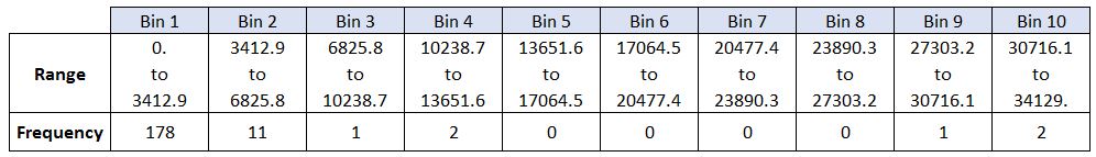
By default, the histrogram method breaks up the dataset into 10 bins. The figure below summarizes the bin ranges and the frequency distribution of immigration in 2013. We can see that in 2013:

  • 178 countries contributed between 0 to 3412.9 immigrants

  • 11 countries contributed between 3412.9 to 6825.8 immigrants

  • 1 country contributed between 6285.8 to 10238.7 immigrants, and so on..

We can easily graph this distribution by passing kind=hist to plot().

can['2013'].plot(kind='hist', figsize=(8, 5)) # add a title to the histogram plt.title('Histogram of Immigration from 195 Countries in 2013') # add y-label plt.ylabel('Number of Countries') # add x-label plt.xlabel('Number of Immigrants') plt.show()
Image in a Jupyter notebook

In the above plot, the x-axis represents the population range of immigrants in intervals of 3412.9. The y-axis represents the number of countries that contributed to the aforementioned population.

Notice that the x-axis labels do not match with the bin size. This can be fixed by passing in a xticks keyword that contains the list of the bin sizes, as follows:

# 'bin_edges' is a list of bin intervals count, bin_edges = np.histogram(can['2013']) can['2013'].plot(kind='hist', figsize=(8, 5), xticks=bin_edges) plt.title('Histogram of Immigration from 195 countries in 2013') # add a title to the histogram plt.ylabel('Number of Countries') # add y-label plt.xlabel('Number of Immigrants') # add x-label plt.show()
Image in a Jupyter notebook

We can also plot multiple histograms on the same plot. For example, let's try to answer the following questions using a histogram.

Question: What is the immigration distribution for Denmark, Norway, and Sweden for years 1980 - 2013?

# let's quickly view the dataset can.loc[['Denmark', 'Norway', 'Sweden'], years]
# generate histogram can.loc[['Denmark', 'Norway', 'Sweden'], years].plot.hist()
<AxesSubplot:ylabel='Frequency'>
Image in a Jupyter notebook

That does not look right!

Don't worry, you'll often come across situations like this when creating plots. The solution often lies in how the underlying dataset is structured.

Instead of plotting the population frequency distribution of the population for the 3 countries, pandas instead plotted the population frequency distribution for the years.

This can be easily fixed by first transposing the dataset, and then plotting as shown below.

# transpose dataframe df_t = can.loc[['Denmark', 'Norway', 'Sweden'], years].transpose() df_t.head()
# generate histogram df_t.plot(kind='hist', figsize=(10, 6)) plt.title('Histogram of Immigration from Denmark, Norway, and Sweden from 1980 - 2013') plt.ylabel('Number of Years') plt.xlabel('Number of Immigrants') plt.show()
Image in a Jupyter notebook

Let's make a few modifications to improve the impact and aesthetics of the previous plot:

  • increase the bin size to 15 by passing in bins parameter;

  • set transparency to 60% by passing in alpha parameter;

  • label the x-axis by passing in x-label parameter;

  • change the colors of the plots by passing in color parameter.

# let's get the x-tick values count, bin_edges = np.histogram(df_t, 15) # un-stacked histogram df_t.plot(kind ='hist', figsize=(10, 6), bins=15, alpha=0.6, xticks=bin_edges, color=['coral', 'darkslateblue', 'mediumseagreen'] ) plt.title('Histogram of Immigration from Denmark, Norway, and Sweden from 1980 - 2013') plt.ylabel('Number of Years') plt.xlabel('Number of Immigrants') plt.show()
Image in a Jupyter notebook

Tip: For a full listing of colors available in Matplotlib, run the following code in your python shell:

import matplotlib for name, hex in matplotlib.colors.cnames.items(): print(name, hex)

If we do not want the plots to overlap each other, we can stack them using the stacked parameter. Let's also adjust the min and max x-axis labels to remove the extra gap on the edges of the plot. We can pass a tuple (min,max) using the xlim paramater, as show below.

count, bin_edges = np.histogram(df_t, 15) xmin = bin_edges[0] - 10 # first bin value is 31.0, adding buffer of 10 for aesthetic purposes xmax = bin_edges[-1] + 10 # last bin value is 308.0, adding buffer of 10 for aesthetic purposes # stacked Histogram df_t.plot(kind='hist', figsize=(10, 6), bins=15, xticks=bin_edges, color=['coral', 'darkslateblue', 'mediumseagreen'], stacked=True, xlim=(xmin, xmax) ) plt.title('Histogram of Immigration from Denmark, Norway, and Sweden from 1980 - 2013') plt.ylabel('Number of Years') plt.xlabel('Number of Immigrants') plt.show()
Image in a Jupyter notebook

Question: Use the scripting layer to display the immigration distribution for Greece, Albania, and Bulgaria for years 1980 - 2013? Use an overlapping plot with 15 bins and a transparency value of 0.35.

# create a dataframe of the countries of interest (cof) df_cof = can.loc[['Greece', 'Albania', 'Bulgaria'], years] # transpose the dataframe df_cof = df_cof.transpose() # let's get the x-tick values count, bin_edges = np.histogram(df_cof, 15) # Un-stacked Histogram df_cof.plot(kind ='hist', figsize=(10, 6), bins=15, alpha=0.35, xticks=bin_edges, color=['coral', 'darkslateblue', 'mediumseagreen'] ) plt.title('Histogram of Immigration from Greece, Albania, and Bulgaria from 1980 - 2013') plt.ylabel('Number of Years') plt.xlabel('Number of Immigrants') plt.show()
Image in a Jupyter notebook

Bar Charts (Dataframe)

A bar plot is a way of representing data where the length of the bars represents the magnitude/size of the feature/variable. Bar graphs usually represent numerical and categorical variables grouped in intervals.

To create a bar plot, we can pass one of two arguments via kind parameter in plot():

  • kind=bar creates a vertical bar plot

  • kind=barh creates a horizontal bar plot

Vertical bar plot

In vertical bar graphs, the x-axis is used for labelling, and the length of bars on the y-axis corresponds to the magnitude of the variable being measured. Vertical bar graphs are particularly useful in analyzing time series data. One disadvantage is that they lack space for text labelling at the foot of each bar.

Let's start off by analyzing the effect of Iceland's Financial Crisis:

The 2008 - 2011 Icelandic Financial Crisis was a major economic and political event in Iceland. Relative to the size of its economy, Iceland's systemic banking collapse was the largest experienced by any country in economic history. The crisis led to a severe economic depression in 2008 - 2011 and significant political unrest.

Question: Let's compare the number of Icelandic immigrants (country = 'Iceland') to Canada from year 1980 to 2013.

# step 1: get the data df_iceland = can.loc['Iceland', years] df_iceland.head()
1980 17 1981 33 1982 10 1983 9 1984 13 Name: Iceland, dtype: object
# step 2: plot data df_iceland.plot(kind='bar', figsize=(10, 6)) plt.xlabel('Year') # add to x-label to the plot plt.ylabel('Number of immigrants') # add y-label to the plot plt.title('Icelandic immigrants to Canada from 1980 to 2013') # add title to the plot plt.show()
Image in a Jupyter notebook

The bar plot above shows the total number of immigrants broken down by each year. We can clearly see the impact of the financial crisis; the number of immigrants to Canada started increasing rapidly after 2008.

Let's annotate this on the plot using the annotate method of the scripting layer or the pyplot interface. We will pass in the following parameters:

  • s: str, the text of annotation.

  • xy: Tuple specifying the (x,y) point to annotate (in this case, end point of arrow).

  • xytext: Tuple specifying the (x,y) point to place the text (in this case, start point of arrow).

  • xycoords: The coordinate system that xy is given in - 'data' uses the coordinate system of the object being annotated (default).

  • arrowprops: Takes a dictionary of properties to draw the arrow:

    • arrowstyle: Specifies the arrow style, '->' is standard arrow.

    • connectionstyle: Specifies the connection type. arc3 is a straight line.

    • color: Specifies color of arrow.

    • lw: Specifies the line width.

I encourage you to read the Matplotlib documentation for more details on annotations: http://matplotlib.orsg/api/pyplot_api.html#matplotlib.pyplot.annotate.

df_iceland.plot(kind='bar', figsize=(10, 6), rot=90) # rotate the xticks(labelled points on x-axis) by 90 degrees plt.xlabel('Year') plt.ylabel('Number of Immigrants') plt.title('Icelandic Immigrants to Canada from 1980 to 2013') # Annotate arrow plt.annotate('', # s: str. Will leave it blank for no text xy=(32, 70), # place head of the arrow at point (year 2012 , pop 70) xytext=(28, 20), # place base of the arrow at point (year 2008 , pop 20) xycoords='data', # will use the coordinate system of the object being annotated arrowprops=dict(arrowstyle='->', connectionstyle='arc3', color='blue', lw=2) ) plt.show()
Image in a Jupyter notebook

Let's also annotate a text to go over the arrow. We will pass in the following additional parameters:

  • rotation: rotation angle of text in degrees (counter clockwise)

  • va: vertical alignment of text [‘center’ | ‘top’ | ‘bottom’ | ‘baseline’]

  • ha: horizontal alignment of text [‘center’ | ‘right’ | ‘left’]

df_iceland.plot(kind='bar', figsize=(10, 6), rot=90) plt.xlabel('Year') plt.ylabel('Number of Immigrants') plt.title('Icelandic Immigrants to Canada from 1980 to 2013') # Annotate arrow plt.annotate('', # s: str. will leave it blank for no text xy=(32, 70), # place head of the arrow at point (year 2012 , pop 70) xytext=(28, 20), # place base of the arrow at point (year 2008 , pop 20) xycoords='data', # will use the coordinate system of the object being annotated arrowprops=dict(arrowstyle='->', connectionstyle='arc3', color='blue', lw=2) ) # Annotate Text plt.annotate('2008 - 2011 Financial Crisis', # text to display xy=(28, 30), # start the text at at point (year 2008 , pop 30) rotation=72.5, # based on trial and error to match the arrow va='bottom', # want the text to be vertically 'bottom' aligned ha='left', # want the text to be horizontally 'left' algned. ) plt.show()
Image in a Jupyter notebook

Horizontal Bar Plot

Sometimes it is more practical to represent the data horizontally, especially if you need more room for labelling the bars. In horizontal bar graphs, the y-axis is used for labelling, and the length of bars on the x-axis corresponds to the magnitude of the variable being measured. As you will see, there is more room on the y-axis to label categorical variables.

Question: Using the scripting later and the df_can dataset, create a horizontal bar plot showing the total number of immigrants to Canada from the top 15 countries, for the period 1980 - 2013. Label each country with the total immigrant count.

Step 1: Get the data pertaining to the top 15 countries.

### type your answer here can.sort_values(by='Total', ascending=True, inplace=True) # get top 15 countries df_top15 = can['Total'].tail(15) df_top15
Country Romania 187170 Viet Nam 194292 Jamaica 212862 France 218182 Lebanon 230718 Poland 278482 Republic of Korea 285162 Sri Lanka 296716 Iran (Islamic Republic of) 351846 United States of America 482244 Pakistan 483200 Philippines 1022782 United Kingdom of Great Britain and Northern Ireland 1103000 China 1319924 India 1383808 Name: Total, dtype: int64

Step 2: Plot data:

  1. Use kind='barh' to generate a bar chart with horizontal bars.

  2. Make sure to choose a good size for the plot and to label your axes and to give the plot a title.

  3. Loop through the countries and annotate the immigrant population using the anotate function of the scripting interface.

df_top15.plot(kind='barh', figsize=(12, 12), color='steelblue') plt.xlabel('Number of Immigrants') plt.title('Top 15 Conuntries Contributing to the Immigration to Canada between 1980 - 2013') # annotate value labels to each country for index, value in enumerate(df_top15): label = format(int(value), ',') # format int with commas # place text at the end of bar (subtracting 47000 from x, and 0.1 from y to make it fit within the bar) plt.annotate(label, xy=(value - 47000, index - 0.10), color='white') plt.show()
Image in a Jupyter notebookImage in a Jupyter notebookImage in a Jupyter notebookImage in a Jupyter notebookImage in a Jupyter notebookImage in a Jupyter notebookImage in a Jupyter notebookImage in a Jupyter notebookImage in a Jupyter notebookImage in a Jupyter notebookImage in a Jupyter notebookImage in a Jupyter notebookImage in a Jupyter notebookImage in a Jupyter notebookImage in a Jupyter notebook